Emarsys Dashboard
The Problem
Emarsys used to lack a decent landing page — when you logged into our platform, we just displayed some random data we found here and there. Numbers and text, mostly torn out of context, stripping them of their meaning and impact.
We wanted to provide a meaningful landing page — after logging in, the marketer should be able to catch up with what's been going on in their own Emarsys account, turning the data into insights. Is everything working alright? How are our campaigns doing compared to last month? Are we getting enough conversions? How about our audience growth?
By answering questions like these, we'd be helping out our customers getting a quick glimpse at the key metrics of their digital marketing activities — and at the same time, we'd also communicate how Emarsys is helping them achieving their goals.
Our Solution
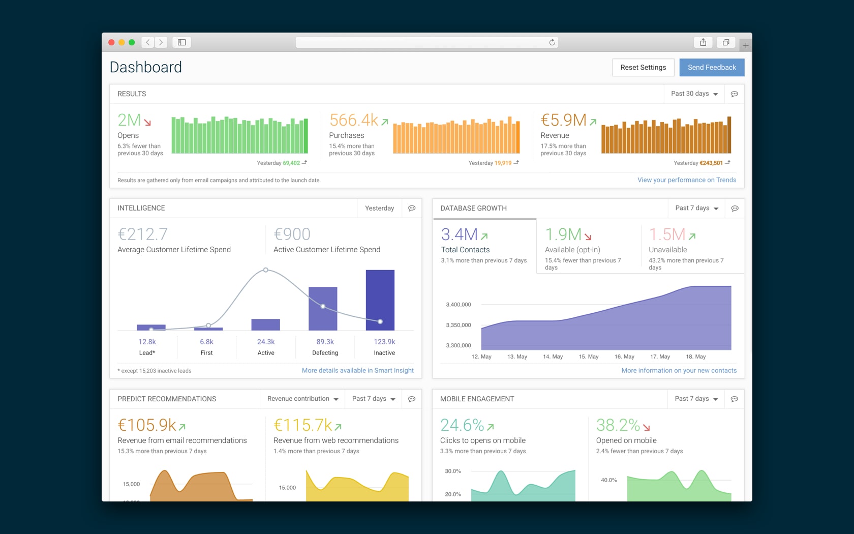
The Dashboard is essentially, well, a dashboard — everyone knows them. But unlike most dashboards, we didn't just want to overload our customers' senses with random charts and visualisations — we wanted to focus on the important bits.
So after talking to marketers and sales people, we decided to display the following key information in our dashboard:
- Results: how many opens, purchases, and revenue your Emarsys campaigns have generated in the past week or month?
- Intelligence: how many customers you have in each lifecycle stage, and how well they're converting?
- Database Growth: how many contacts you have in your database, and at what pace your audience is growing?
- Automation: how's your automated campaigns performing? (These automated campaigns are happening without a marketer having to manually manage them, so in a way, it's free money.)
- Recent E-mail Campaigns: how's your latest e-mail campaigns performing?
- Scheduled Campaigns: what e-mail campaigns are coming up next?
- Mobile Engagement: how your campaigns are performing on mobile compared to desktop?
The visualised data in these widgets help our customers see a pretty comprehensive picture of various activities in their Emarsys account — and if they want to know more about certain bits, they can just drill further down, as we show in-context info pop-ups and links to relevant reports.
Key Features
- Visualises key metrics in context: compare data to previous time periods and other campaigns.
- On-demand granular details: hover to see more in-context information, and jump to relevant reports and resources.
- Tells the Emarsys narrative: showing our customers the impact of our platform on their marketing.
My Challenges
- Data visualisation is an entire craft per se, and researching this topic and experimenting with various ways to display data was a real learning experience for me.
- Visualising data is one thing, but getting that data is another. We had to map our software to see what sort of data is actually available, and turn it into resources we can use in our Dashboard.
- Getting to know external libraries is always challenging. In our case, we used a framework for displaying the visualisations. Learning about its capabilities and customising it to our needs were meaty tasks.
What I Liked
I really enjoyed coming up with concepts and prototypes for visualising data. We hallway tested them to see what sticks. There were some really surprising insights about how people read different charts!
What I'd Have Done Differently
I would've loved to continue working on this product, turning it into a more flexible, more powerful tool — with more available widgets, more customisation options. Even though we had plans for this, sadly we had to move onto working on another project. Oh well!
Personal Notes
The Dashboard was one of the first projects in Emarsys that had the freshly formed in-house UX team actively involved. The smaller scope of the project proved to be an ideal context to experiment with cross-team workflows and communication.
The Importance of the Dashboard: as it's the first meaningful page the marketer sees, the Dashboard gives the first impression — it sets both the mood and expectations; visualises success metrics in an engaging, digestible way; and shows off the capabilities of Emarsys, so it doubles as a powerful sales tool.
Diverging and Converging: first, we had to determine which metrics to display, and then how to display them.
We surveyed both our customers and our sales team to see what metrics were useful for these groups. We narrowed down the list of metrics to just a handful — one that can be used to tell the story of Emarsys, while also super useful for marketers.
I made a bunch of concepts for various data visualisations for each metrics — we tested them, and decided which ones to go with.
Strong Ideas, Loosely Held: we had buckets of cool ideas. Most of them we scrapped: widget gallery, blueprints for business verticals, turning the Dashboard into a platform… sometimes we just have to let cool but uneconomical things go. No hard feelings.
Diminishing Returns: we had to find the sweet spot between functionality and feasibility, and learn to let ideas go; we could've made the best, most feature-rich, and most expensive interface — and while it would've been neat, our customers might not actually need that.
More importantly, our customers have needs outside the realms of the Dashboard — so we decided to focus on those needs instead.
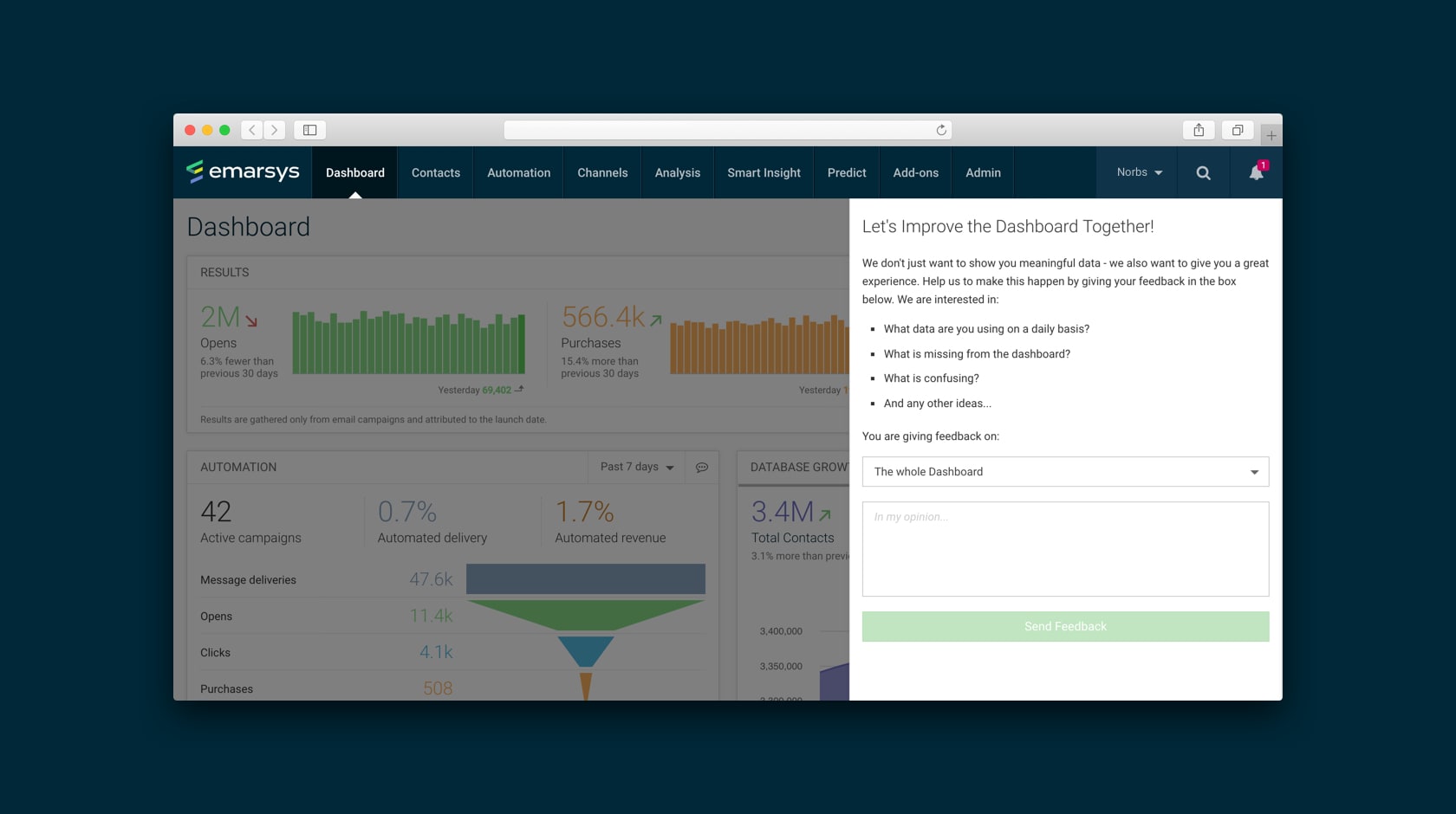
We also experimented with ways to gather feedback. The Dashboard was one of the first interfaces in Emarsys which proactively encouraged marketers to send feedback through a custom-built form. It was a success: we've received a multitude of useful insights from our customers, which helped us better understand their problems and needs. This turned out to be the proof of concept for our Intercom integration down the line.
This first version of Dashboard also laid the foundation for our Dashboard design guidelines, which were later used to design several more widget-based screens in our platform.