Stylers Rebrand
Stylers is a development agency I had the pleasure to work for as a designer between 2012 and 2015.
By 2014, neither the brand nor the website have changed for about 5 years. We all thought they both felt a bit outdated — and we wanted to modernise them.
The Logo
The mark of Stylers is a hummingbird — symbolising agility, endurance, and precision. It's also an incredibly cute subject material, so abandoning this birdie was certainly not an option.
The old logotype was a futuristic display type — somehow, it always reminded me of hit 90s TV show Sliders title card. To communicate neutrality, flexibility, and internationality, we switched it to a slightly customised version of Helvetica.
The old logo was just a vectorised graphic of a stock photo; with the improved logo, I aimed to create something unique and aesthetically sound — with less tiny details to make the logo easier to comprehend in smaller sizes.
One lesson I've learned: giving a silhouette a subtle eye brings it to life.
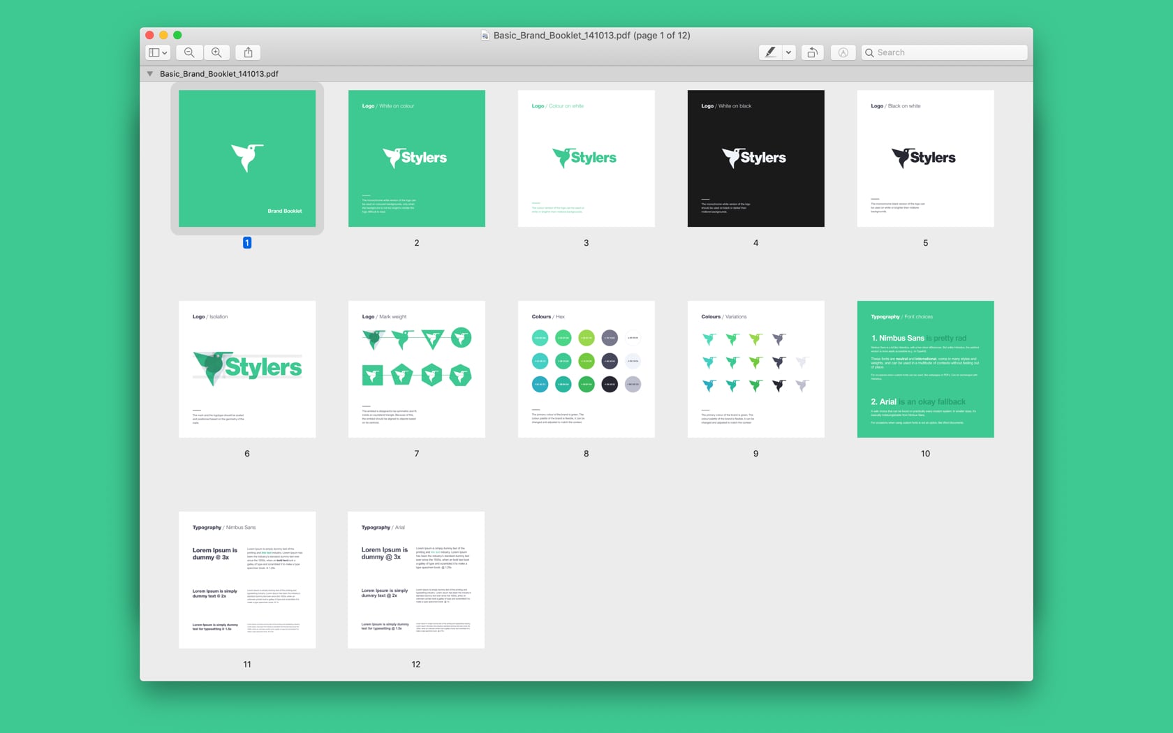
I also created a small brand styleguide to help my colleagues implementing the brand correctly in various media.
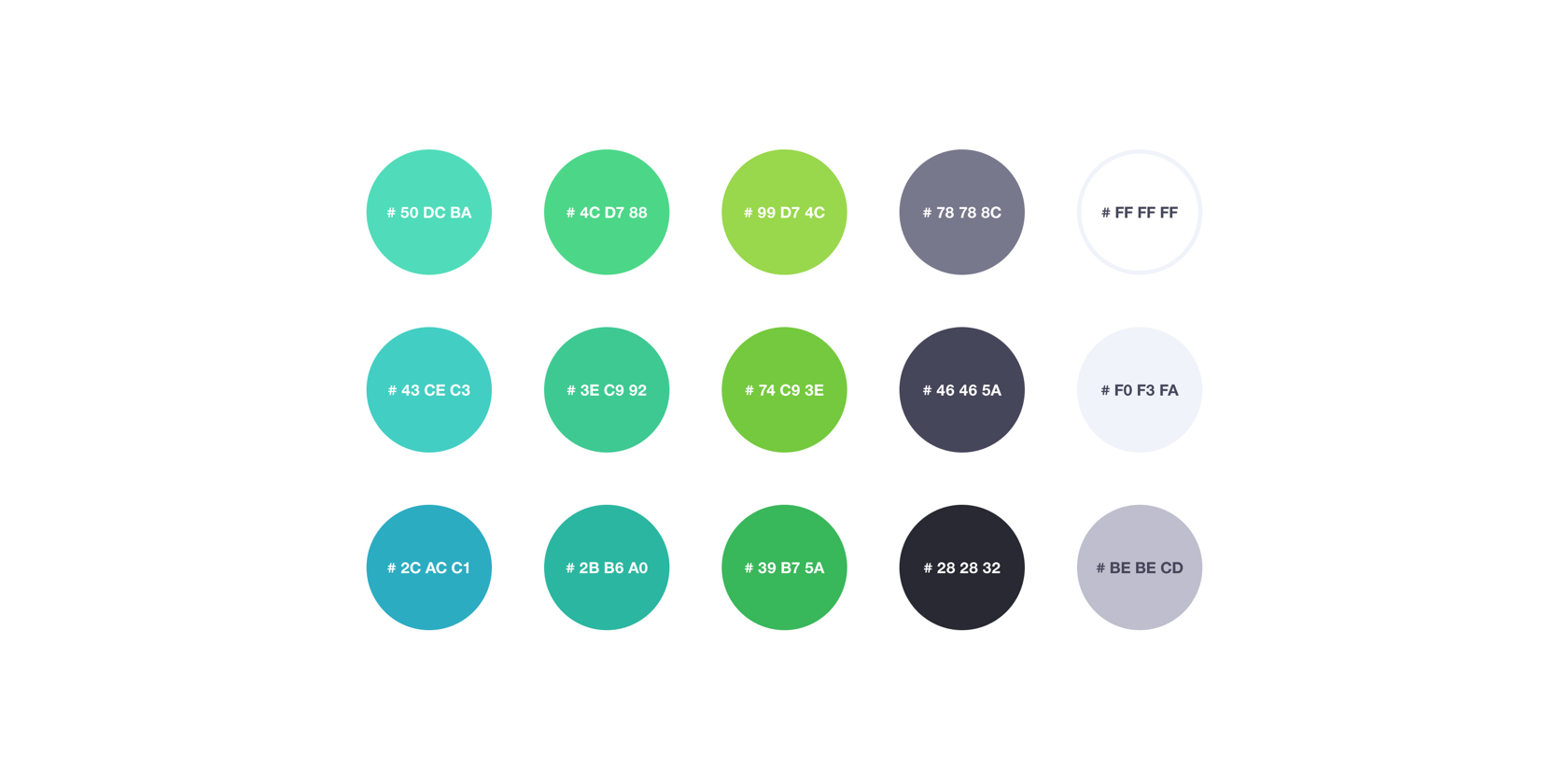
The Palette
For the brand colour, we iterated on the original pine green, and went with emerald green. It's an energetic, playful colour that's used widely in contemporary digital products and services. This tone was also Pantone colour of the year, so there you go.
Since Stylers is mostly dealing with web design and development — with some apps on the side —, the company site has to demonstrate the quality and values goes into this craft.
The Storefront
With the new site, we wanted to put the limelight on our works and services, while also smuggling some of the team's personality into it.
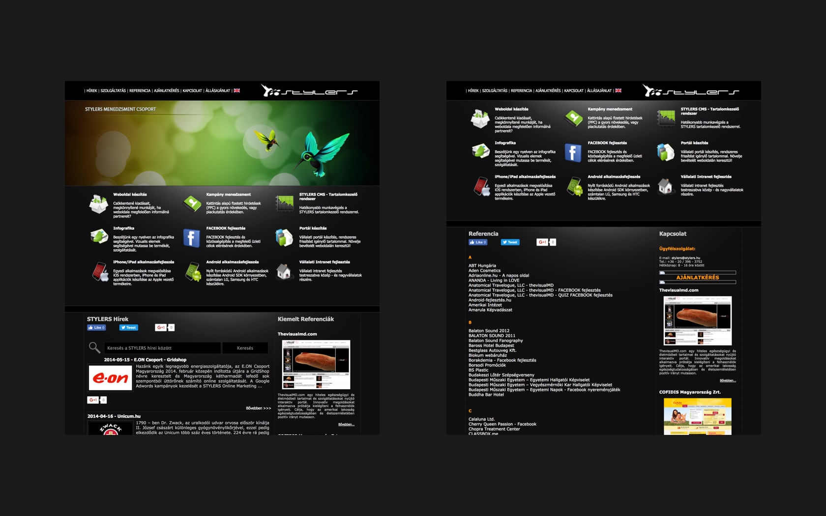
The old site was dark, had small text, and operated with some questionable design choices — like how our portfolio was just an alphabetical simple text list.
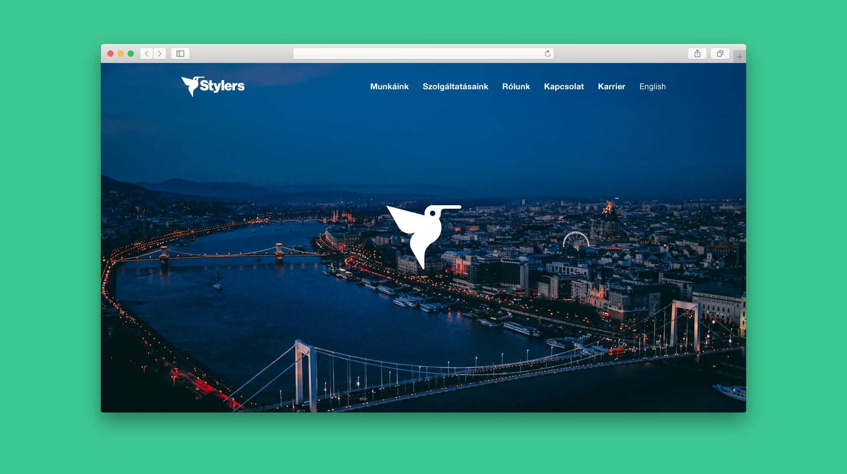
Visually, we made the page brighter, used popping colours and motion design to make it feel energetic, added iconography and better type to make it more legible.
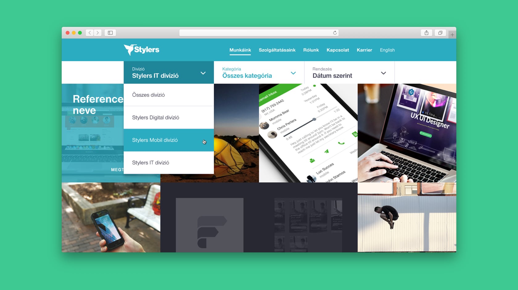
The work and services sections became more visual, with iconography and large imagery used everywhere — so you could not only read about what we do, but see the results as well.
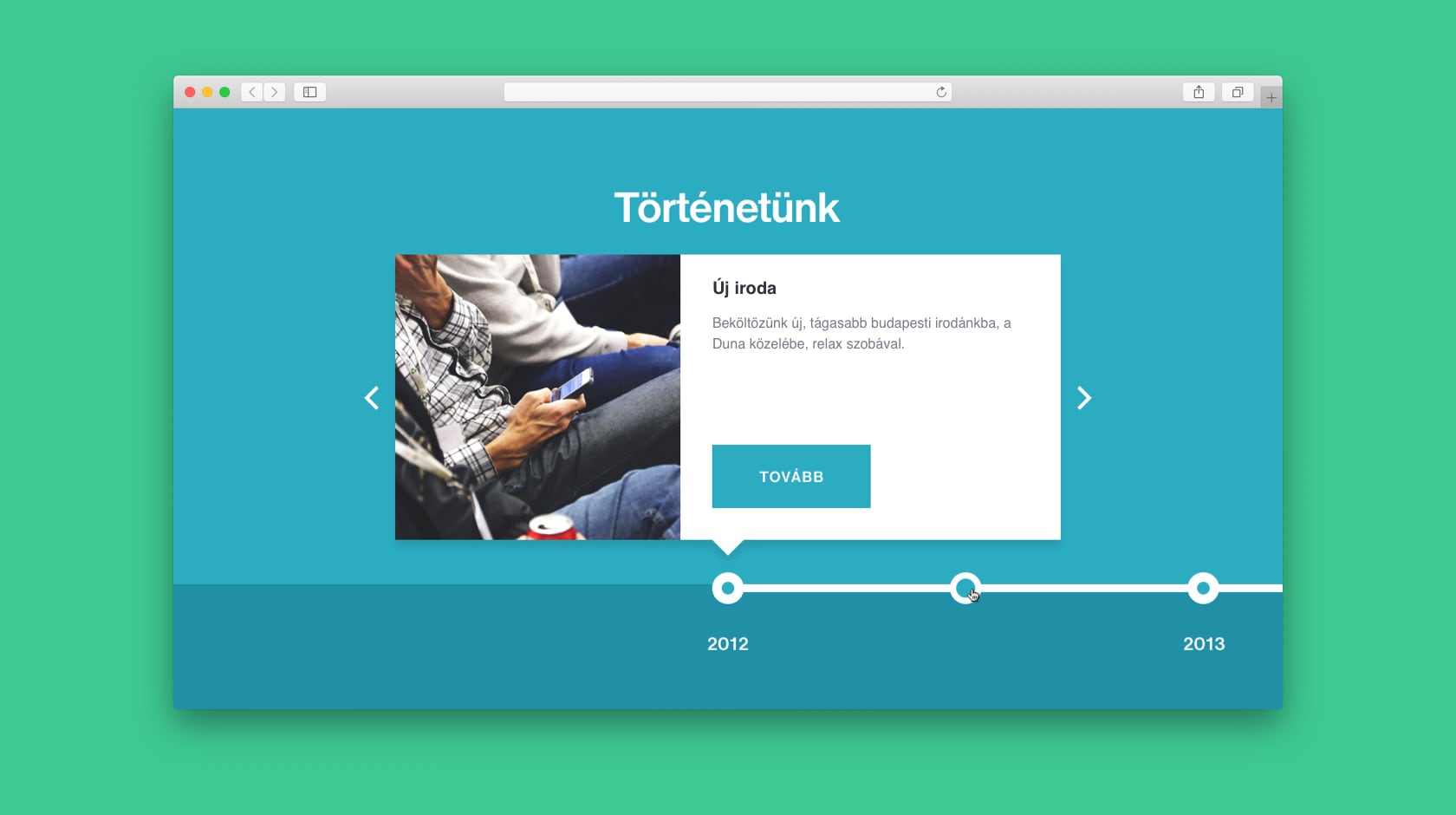
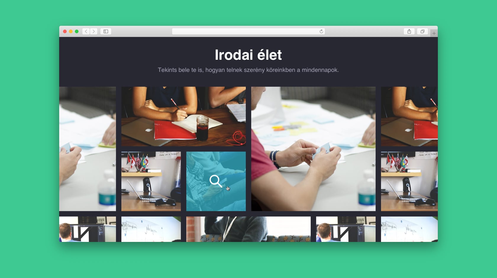
The visual timeline and photo gallery were subtle additions to make the site a bit more humane — so visitors can see that the company is not just a blank, bureaucratic agency, but actually a passionate group of people putting their best work out.
There's no question about it — the redesign was a big success. All the people in the company embraced it, and our client base saw it as a progressive step. I feel like Stylers deserved brand that communicates the company's trendy, agile nature.