Emarsys Design System
The Problem
Growth brought Emarsys some coherence problems. New features and products were popping up each quarter, delivering kick-ass business value to our customers — but more often than not, these new products didn’t really feel part of a system.
They sported unique designs: elements, interactions, and patterns which weren’t present at all in other areas of our massive platform — or even worse, remixed already existing solutions.
Users kind of had to re-learn Emarsys every time they hopped into a new product — they were rarely able to use their existing methods and workflows. This really made a confusing, anxiety-ridden customer experience.
What’s more, product teams had to sink a considerate amount of resources into building the unique interface for their new product, reinventing the wheel each time — time and effort that could’ve been spent better elsewhere, like working on the business logic, addressing more user needs, or product-specific usability problems.
Our Solution
With the Emarsys Design System, we had one main goal in mind:
Enable our product teams to build coherent, consistent interfaces quickly and easily.
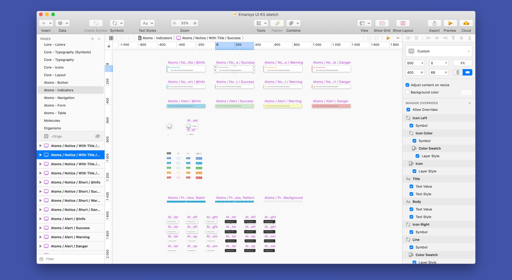
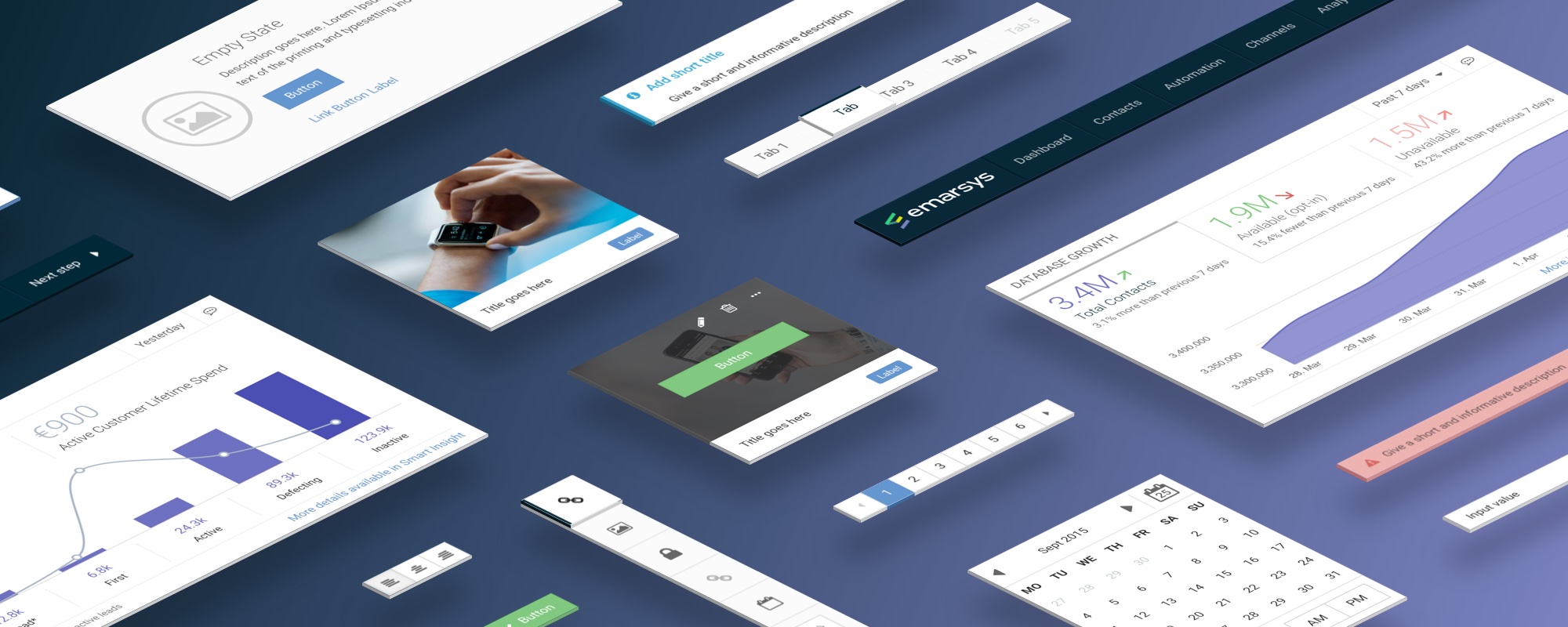
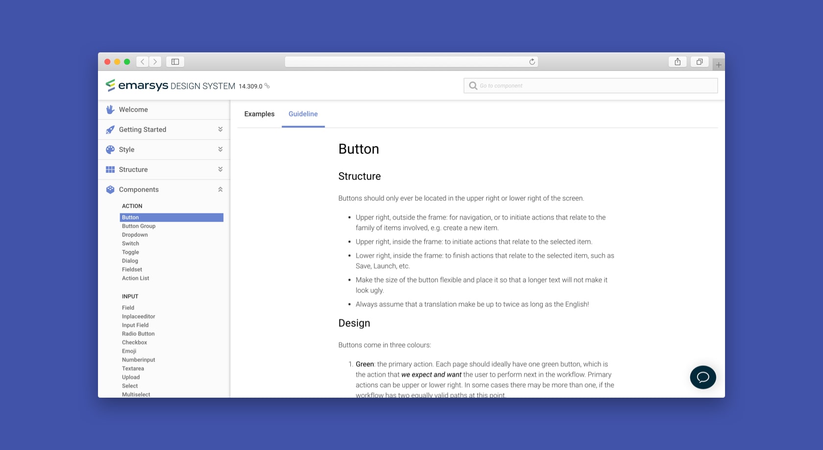
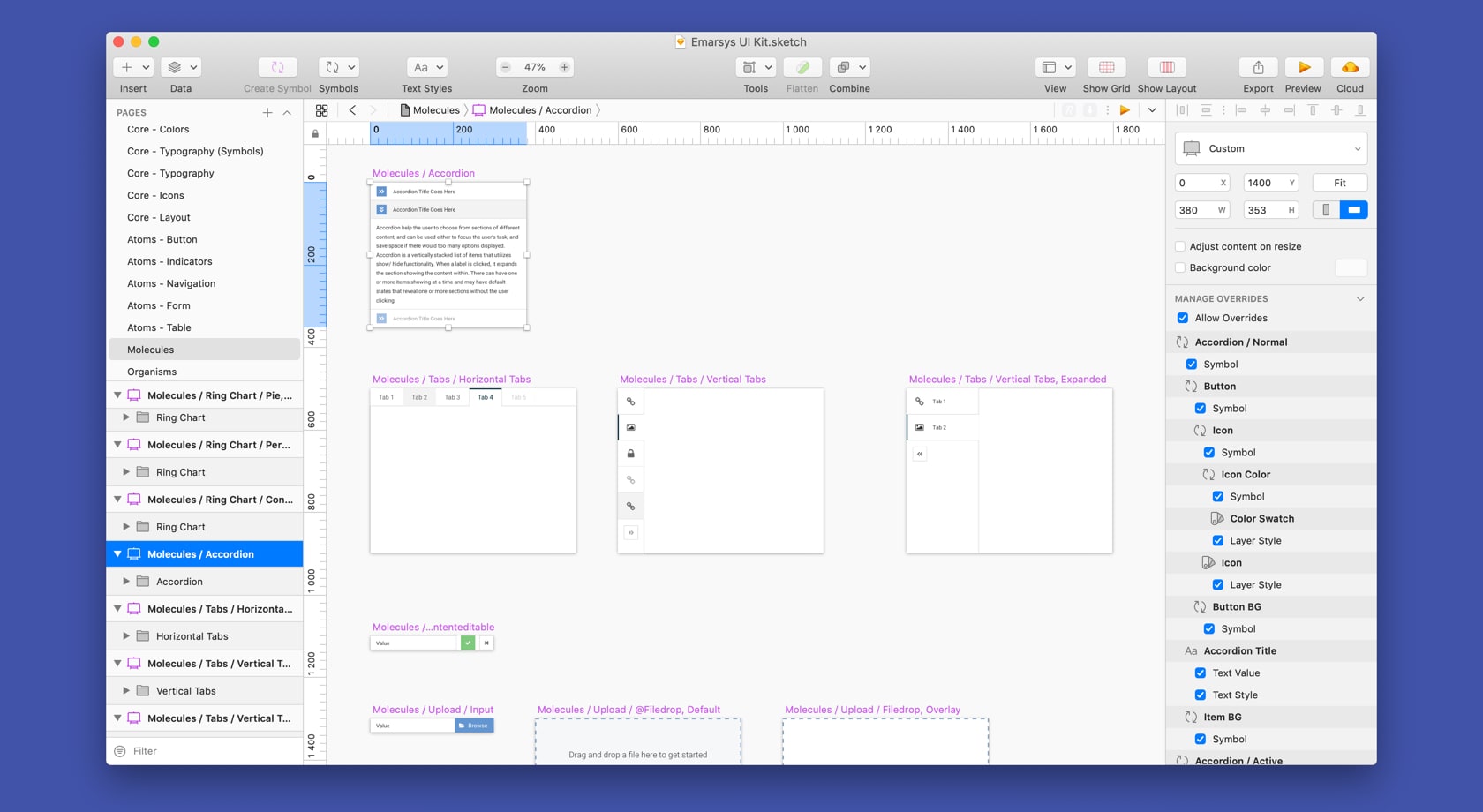
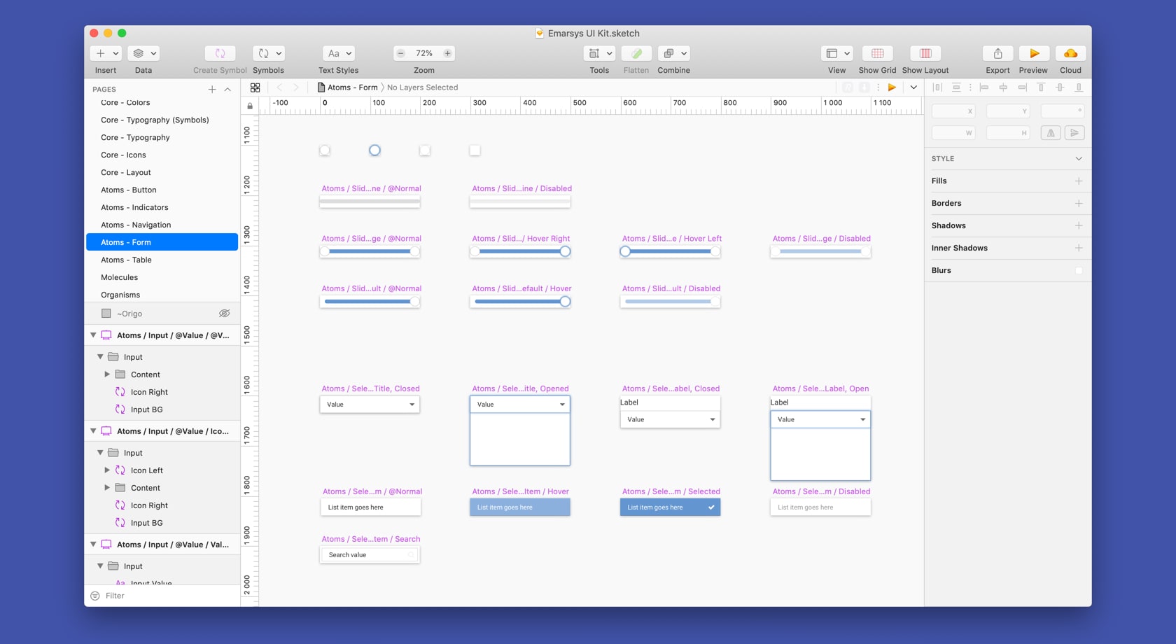
For designers, we provide a comprehensive Sketch library of UI components, with guidelines for how-to and when-to use them.
For developers, we offer reusable state-of-the-art web components, which they can quickly and easily implement in their product.
These components are ranging from simple atomic elements like buttons to complex templates like multi-column, filterable data tables.
Even better, these web components can be updated globally — so when we roll out an update that tweaks the visuals, fixes usability problems, or simply squashes some bugs, the implemented component instance in the product will also get the update, practically automagically.
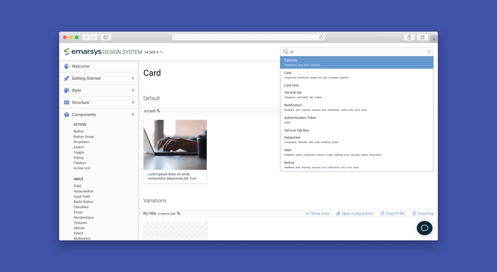
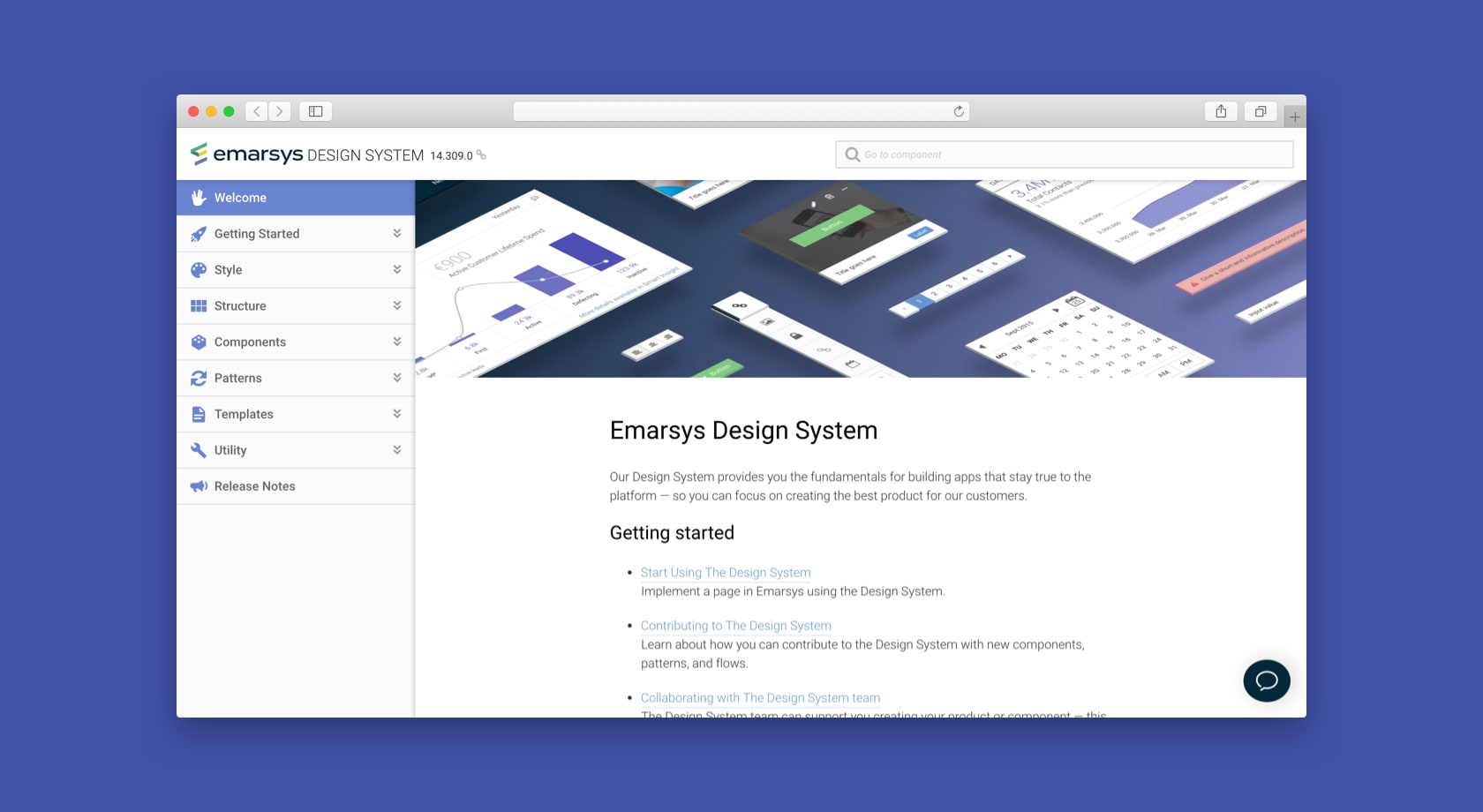
All this knowledge is housed in our Design System webpage: a searchable, organised library of components and guidelines, with living code examples ready for implementation.
Key Features
- Stay coherent easily: work with our central components, both in the design phase (by using our Sketch UI Kit and design guidelines) and in the development phase (by using our living code examples).
- Save time and effort: why would you make a custom date-picker calendar on your own? There is no need to reinvent the wheel for each new product — we’ve got you covered with researched and tested central components.
- Skip the maintenance shift: when we update the component in the design system, the goods will automatically trickle down to your implementation as well.
Process Overview
- Make an atomic UI Kit in Sketch, so designer can build platform pages quickly.
- Expand our existing UI framework with design guidelines to turn it into a proper Design System.
- Continuous iterations based on feedback and needs collected from both product teams and customers.
My Challenges
- Convincing product teams to actually use our Design System instead of just hastily winging their own pages proved to be more difficult than expected. After all, just throwing some dish together might seem easier than precisely following a cookbook, right? We had to focus a lot on evangelising the importance of our Design System by showing developers, product people, and designers what they can win by using it. It mostly came down to time and effort.
- Expanding the Design System is kind of tricky, because you don’t want to end up with too many fringe components — you want to have just enough to cover everything. Grouping functions is key: do we really need a separate “select” and “dropdown list” component?
- Finding the balance between “unique” and “uniform”. The sad reality: our product will never be 100% coherent. There will be expections. There will be experiments. And it’s fine! We want our developers and designers to be creative — we just want them to focus on the important design decisions, instead of reinventing the wheel every time. And sometimes, focusing on these important bits can introduce unique elements in our product, which cannot comfortably be part of our Design System. We just have to handle these exceptions well.
What I Liked
Solving both product and company problems by creating a Design System is super exciting. It has so much potential, it’s literally the main reason I’m happy to work for Emarsys — I arrive in the office with a big-ass grin on my face every morning, because I can move the needle forward, helping our developers, designers, and customers.
Albeit because of the enormous scope of a Design System, it can feel a bit rough and tiring sometimes. There are so many things to consider! For a massive product like the Emarsys Marketing platform, it almost feels like making an operating system UI.
Still, I strongly believe a good Design System is the foundation of any amazing digital product.
What I Would’ve Done Differently
I’d have have focused more on communicating the benefits of the Design System — it’s not that obvious, unless you have the matching mindset. I’d do more talks, visit more product teams, show them how the Design System can make their life easier, and their product better.