The What & Why of Learnability
This is a two part series about using UI heuristics — or, in other words, making interfaces not merely easy to use, but also easy to learn.
In this first part, we’ll discover what heuristics are, and why they’re important. In part two, we’ll learn some quick and simple ways how anyone can make easy to learn interfaces.
As with most content on the Emarsys Craftlab blog, this article is written with developers in mind — but hopefully anyone, from product managers through researchers to designers, can utilise the things listed in this post.
Without further ado, let’s roll.
What Are Heuristics?
Heuristics is one of those quirky terms no one really knows until they look it up — but here’s a word most people have heard: “eureka”.
Both eureka and heuristics come from the same origin — the Greek “heuriskein”, meaning “find” or “discover”.
Supposedly, Archimedes screamed “eureka!” into the aether when, after much trial and error, he finally found a way for determining the purity of gold.
Similarly, “heuristics” refer to hands-on methods, where people can learn something on their own by experimenting.
Most people, especially programmers, have had eureka moments — after all, getting code to work tends to contain at least a pinch of trial and error. Making something work on your own is an entirely different feeling than following guides or merely replicating what a teacher jots on the blackboard.
With the proper use of UI heuristics, anyone can make their software not just simple to pick up and use, but also easier to master.
In different contexts, heuristics can have slightly different meanings. In education, in AI, in mathematics — they all use this word somewhat differently.
In this article, we’re focusing on UI heuristics — which is, generally speaking, a collection of guidelines and practices that help the usability and learnability of user interfaces.
Usability and Learnability
Thankfully, more and more developers mind the usability aspect of their product than two decades ago — after all, it’s kind of important whether people can actually use your software properly or not.
But there’s another ingredient in the batter, usability’s less popular (but just as important) cousin: learnability.
If usability represents the ease and comfort of using your application, then learnability is the ease and comfort of mastering your application.
Because as most things in this crazy world, your software inherently has something that’s called…
The Learning Curve
Unlike heuristics, the term learning curve probably sounds more familiar. It’s a handsome visualisation of the relation between proficiency (expertise, skill) and experience (time spent, number of tries).
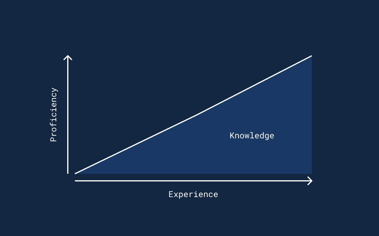
Generally, the more time you spend doing something, the more proficient you become — acquiring knowledge in the process.
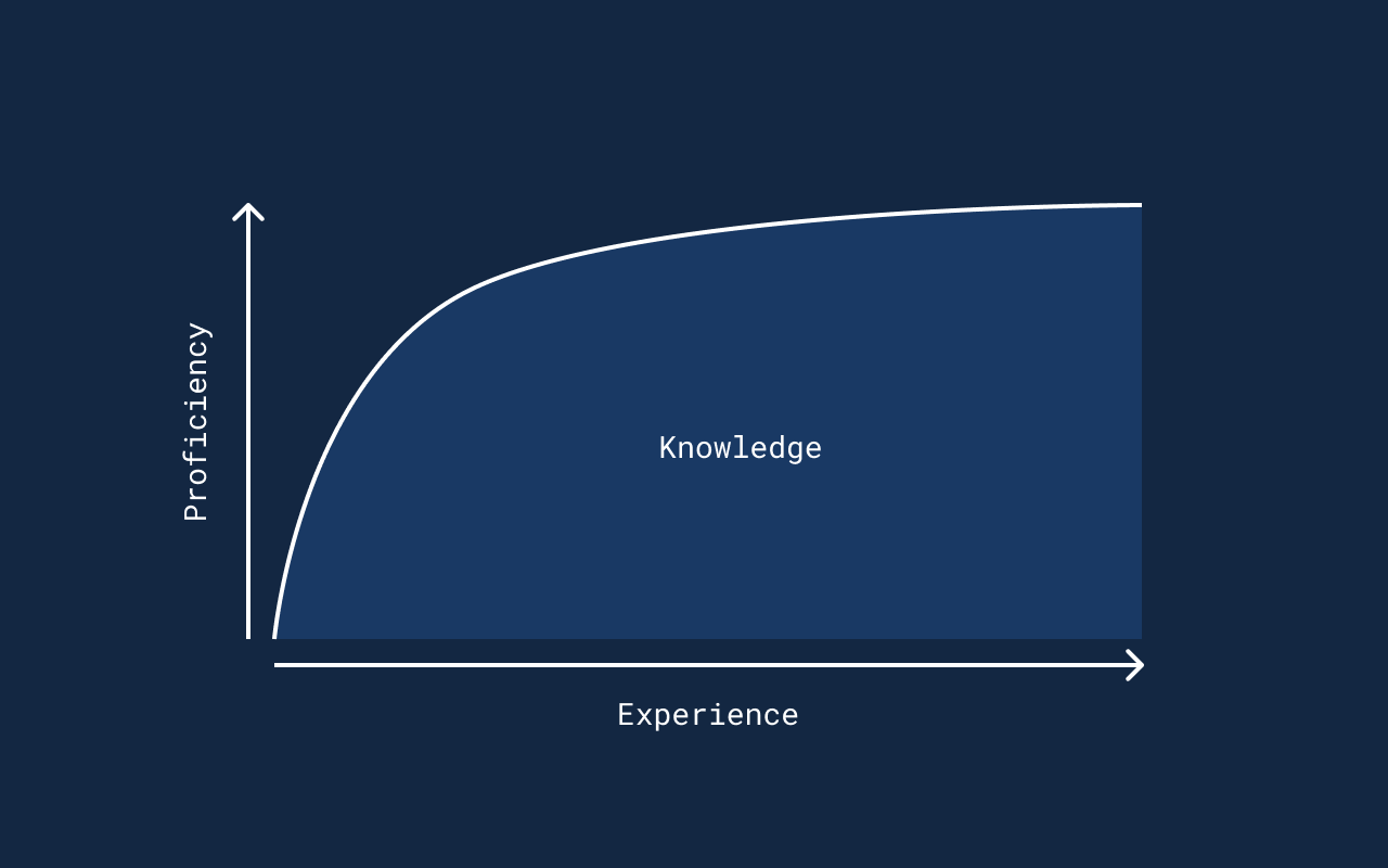
People tend to throw around sentences like “its learning curve is as steep as a wall”, while ironically, a steep learning curve is what we aim for: it means one becomes really proficient in a short amount of time.
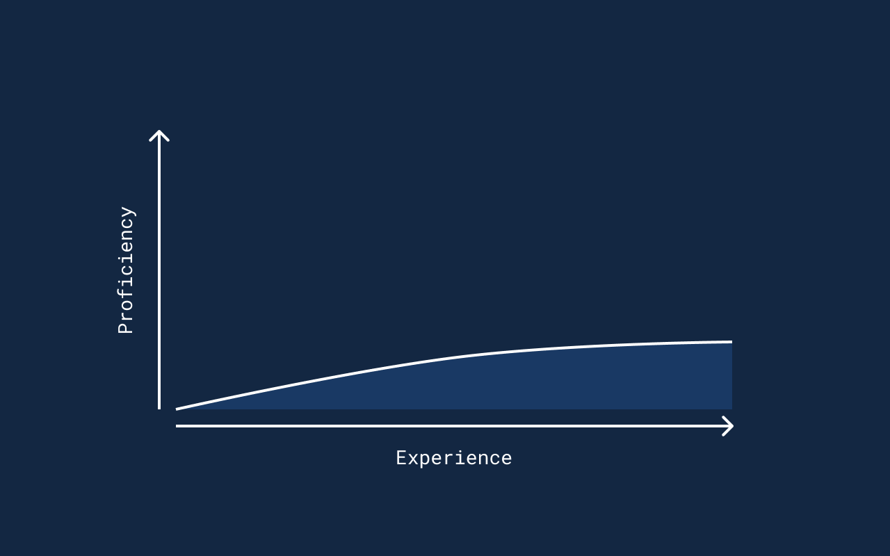
A flat learning curve is the opposite: taking a long time to gather a measly amount of knowledge.
But in most real life scenarios, the average learning curve looks something like this:
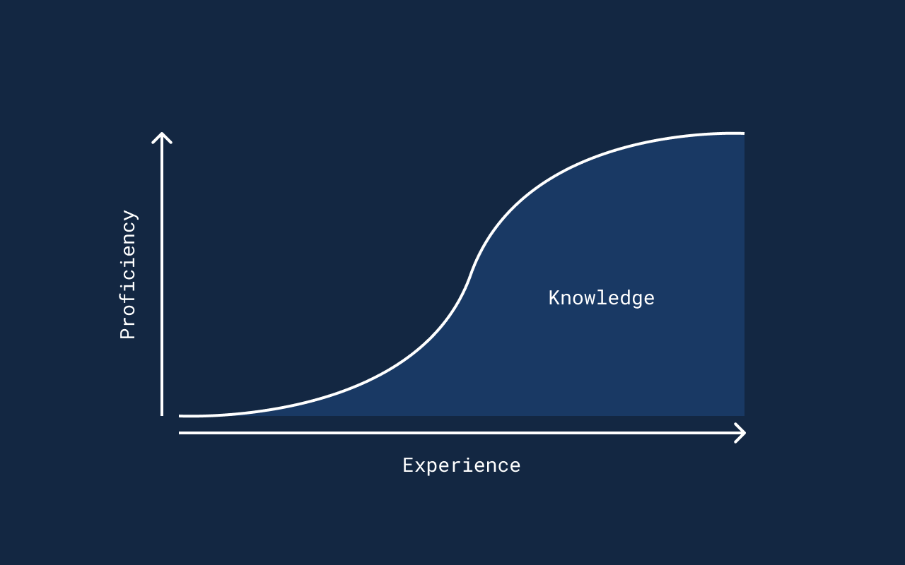
If you take a look at bits of this graph, you can see the following:
1. Slow start: as they say, there’s a first time for everything — and more likely than not, you’ll find it difficult to do something decent the first time you try; be it speaking a new language, drawing a face, playing the guitar, or coding an app. You’re still just tickling the fundamentals, trying to grasp the logic behind it all.
2. Picks up pace: you’ve nailed the basics, and have an overall understanding of the hows and whys. Once this “click” happens, you shift to the fastest gear of learning — especially if you do both hands-on experimenting and proactively looking up learning materials.
3. Plateauing: once you master all the ins and outs of the craft, it will get more difficult to become even more proficient — you’ve hit the so called skill ceiling. Sure, you can still experiment and learn new things, but it’ll be nowhere as easy and quick as building up your knowledge until this point.
With most things you learn, you’ll go thru these 3 phases.
But here’s the twist: it’s not only dealing with the craft itself that builds your knowledge.
The User vs The World
What I’m going to tell you is, of course, super obvious — but bear with me for a few minutes, it will all come together in the end.
Let’s say here’s you.

And you exist in the world.
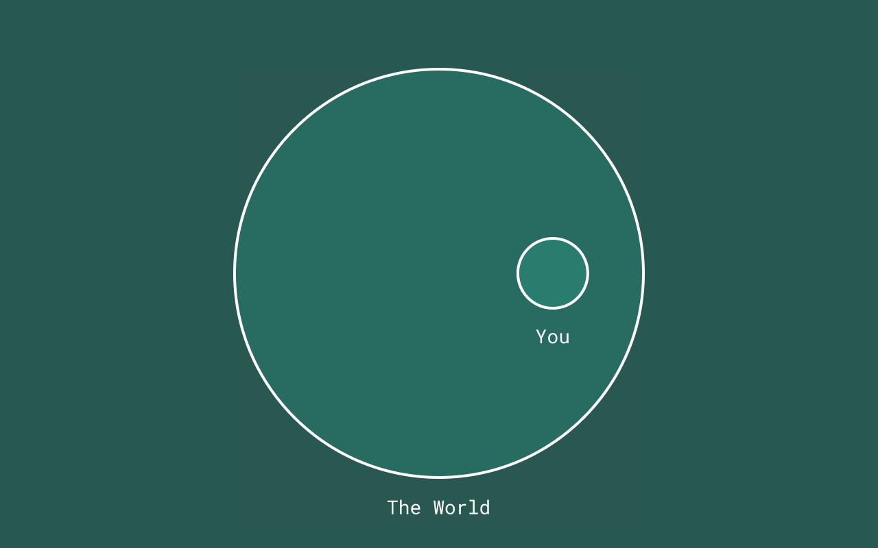
In this world, there’s this Thing and you, for a reason or another, have to interact with it. You might have some goal in mind, and that Thing, you reckon, certainly would help achieving the said goal.
So you start interacting with the Thing — and as you do, you learn about it. Knowledge starts building up inside your brain, and the more knowledge you have, the more different you interact with the Thing.
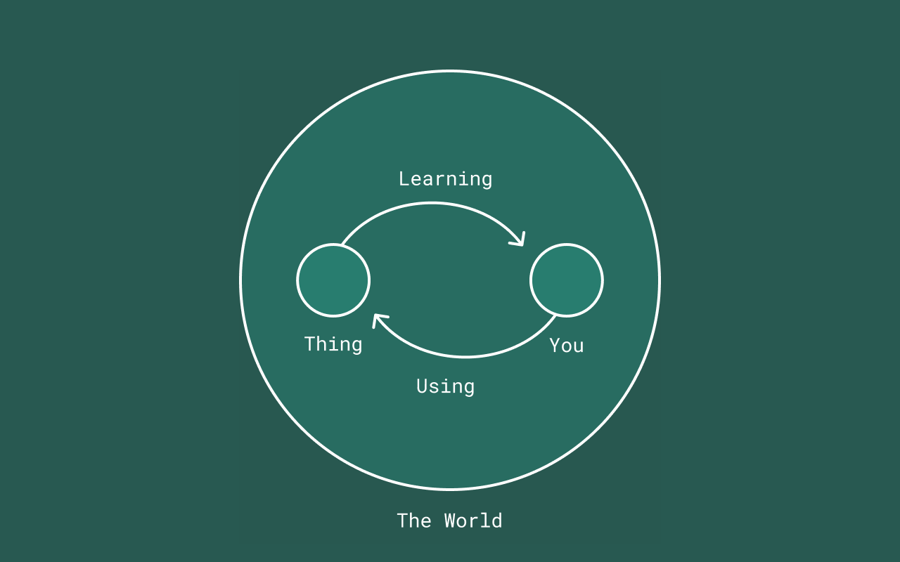
Here’s the catch: there’s not only that one particular Thing that builds your knowledge — it’s all the things in the world. Some of that knowledge might also affect the way you interact with the Thing.
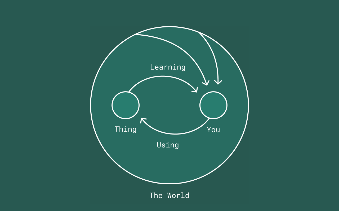
Let’s put this another way: the Thing is an App. You are the user. In the world, you use other apps, web pages and interfaces that influence your understanding, habits, and expectations — all of them affecting your relationship with that one App.

Understanding how to reap the benefits of this existing knowledge is basically the essence of UI heuristics.
The Learning Curve vs The World
Now that we know how external factors influence one’s knowledge, let’s get back to our handy learning curve.
When designing the user interface of our app, we have two goals:
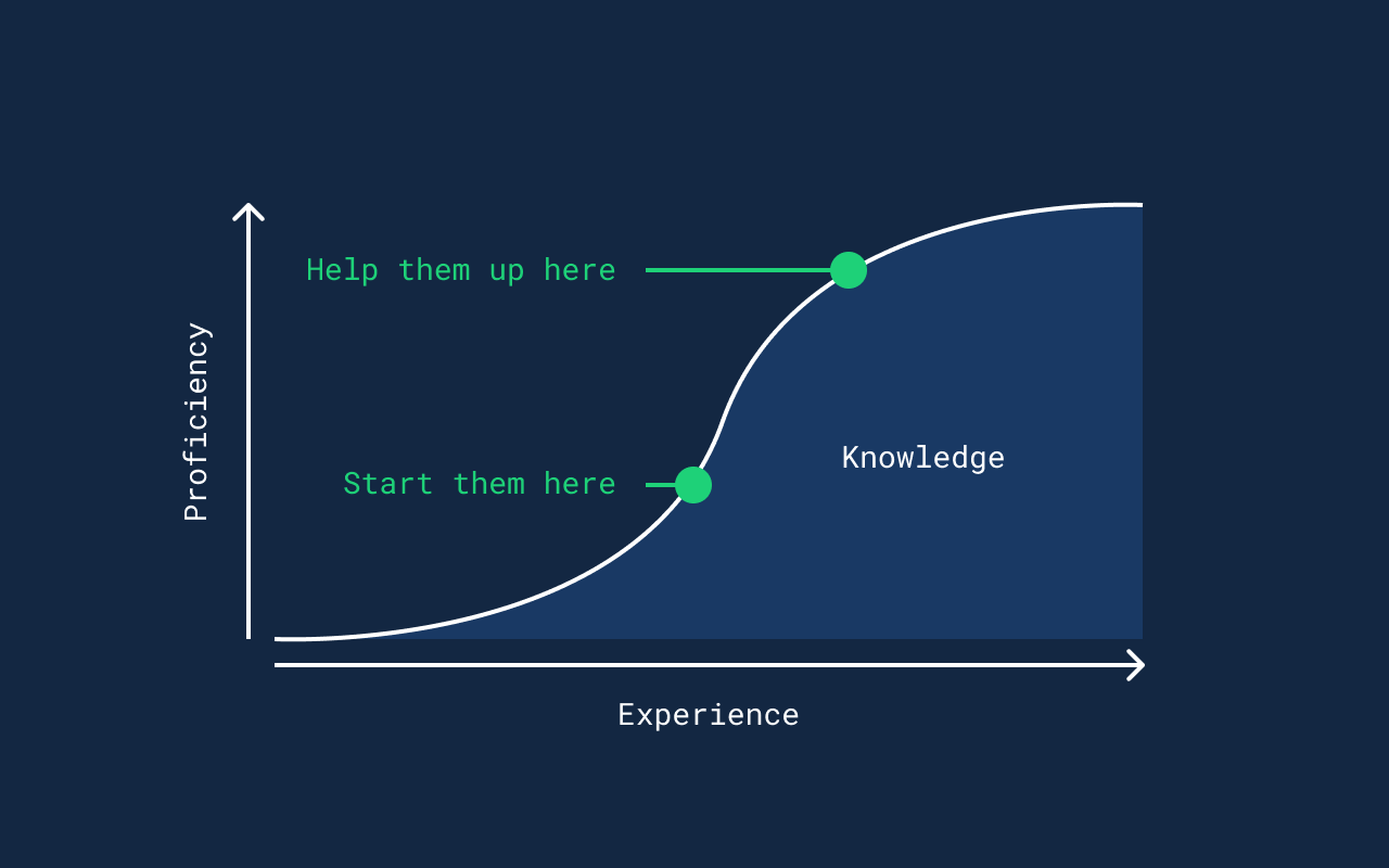
1. Starting our user as high as possible: by knowing their existing knowledge, we can build an interface that they already know — cutting off the dreaded flat bit of the learning curve, enabling them to be productive right from the start. This is mostly usability.
2. Helping the user reach the top as fast as possible: implementing UI heuristic practices, we can help the user reach the skill ceiling as fast as humanly possible — making them even more productive, and thus providing even more value. This is learnability.
Thankfully we have tools to make this two things happen — and we’ll be learning about them in the second part of this article.
Takeaways
If you only take home a single paragraph from this article, I want that to be this:
- Utilise the knowledge the user already has.
- Extend the user’s knowledge.
This is a really simple but powerful mindset to have when designing an interface — as you can lift a lot of weight off from the users’ shoulders if you do your research and create something they can just grab and use right away; but you can also empower the users to master your app and become as efficient and effective as one can possible be.
Coming Soon Sometime in Part 2
We’ll take a look at the heuristic practices that make your app not just easier to pick up and use, but also a breeze to learn. Stay tuned!
Further Reading
- Nielsen’s 10 Usability Heuristics: https://www.nngroup.com/articles/ten-usability-heuristics/
- Learning curve: http://www.psywww.com/intropsych/ch07_cognition/learning_curve.html