Design Sprint
This is the story of how we utilised Google’s Design Sprint to come up with one of the most fleshed out product concepts in our company.
Oh, right: this article is mostly about the Design Sprint method, not the product. We won’t really be the latter in here.
Prologue
It all started off as a perfectly average Thursday.
And don’t we all love these perfectly average Thursdays? The weekend is closing in, everyone is cooling down and starting the final phase of their weekly production cycle before the slow boiling madness of Friday.
But all of the sudden, the news came: we have to refine and present a brand new product concept in just a few days. Oh boy. We only had some sketches and broad ideas to go by. And it wasn’t just any product, it’s one Capital Product which will be taking the limelight for the upcoming years.
We all realised that we needed to take a step back, and the whole team should spend some time planning the product, because at Emarsys we love owning our product. Ownership breeds care and motivation, and that’s ultimately better for everyone: for the people making the product, for the quality of the product, for the people using the product, and so for the business. But to achieve ownership, product development needs to be inclusive, so every party can bring in what they’re best at.
We must do the planning from scratch, and form the product together.
There was no time to waste. So after a quick roundtable among product management, development and UX, we came up with the perfect idea: firing up The Design Sprint.
The Design Sprint
The Design Sprint is popularised by GV, and it’s a pretty solid way of quickly coming up with working product concepts. How quickly? Well, practically in a week. We’ll be focusing on the sprint eight hours a day for the whole week, so time to cancel all those mundane meetings in our calendars.
It is a demanding process, but by the end of the fifth day you have a shared understanding about the product — maybe one of the most valuable “assets” in a larger company — , and an actual-factual battle tested prototype.
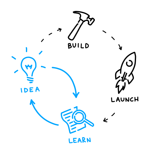
How can be it done so quickly? By cutting the usual ideation-building-launching-learning cycle short: we completely skip building and launching. So after the ideation phase, we rapidly build a prototype and then test it right away, which results in valuable lessons about the validity of our concepts and actual user needs.
You cannot possibly go faster than this without jumping into a fighter jet.

The Emarsys Fighter Jet
Most of the time, the ideal process is not viable. Just like in our case: we simply couldn’t afford eight hours a day. We couldn’t fully purge our calendars. We couldn’t start on Monday, either — we needed that day to brief others about this gig. So in the light of being pragmatic, we had to work within these constrains:
- We start on Tuesday, and finish on next Monday.
- We only have the first four hours of the day for the sprint.
- Some parties cannot attend every single day of the sprint.
Which means we’ll have to do this whole design sprint twice as fast, in a less vacuum-sealed environment.
Now we’re flying a jet at Mach 2. In a thunderstorm.
Day 1: Unpacking
It’s Tuesday, and after making the necessary arrangements on Monday, the stage is finally set.
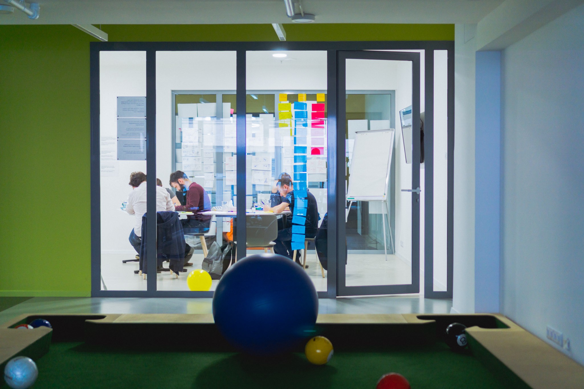
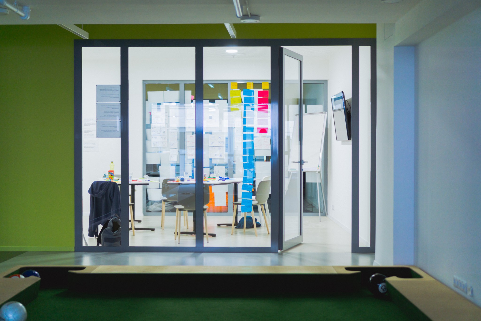
We gathered in a perfectly isolated meeting room with more whiteboard markers, sticky notes and blinding neon lights we’d ever need.
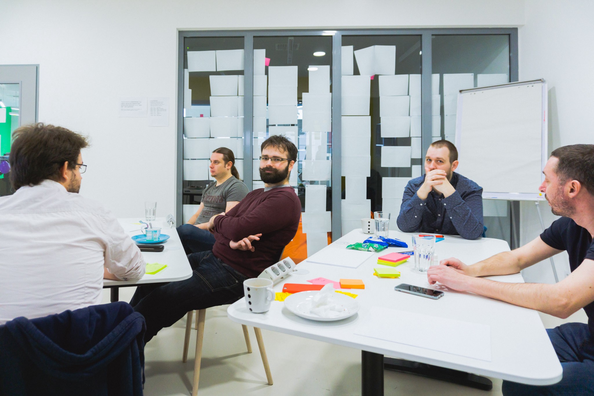
Multiple parties were invited to take part in the sprint: beside the facilitator, we lined up a UX Researcher, a UX Designer, a UI Developer, a Lead Developer, a Developer, and a Product Manager.
Each member of the team brought their own expertise to the table, which is essential to get the best possible results.
Sharing the Vision
It was necessary to hear the high-level vision behind this product, so various stakeholders in the management helped shedding light on concepts and business needs, including the CEO, the head of development and product managers.
These talks were crucial in understanding the expectations — and just to realise why this product is so important to our customers and to our business. The first step towards the infamous shared understanding.
Learning From Our Past
We’ve watched a couple of observation videos of our customers using a legacy version of the product we’re going to draft. Seeing their struggles were both painful and reassuring: “yeah, we can make this better!”
Competitor Checkup
After the talks, we formed three two-person groups, and each group picked a competitor product to analyse. Time to hunt for industry best practices!
It was valuable to look at existing solutions, not merely because reinventing the wheel is often unnecessary, but we could also pinpoint areas where we have the opportunity to do better, and improve our customers’ experiences.
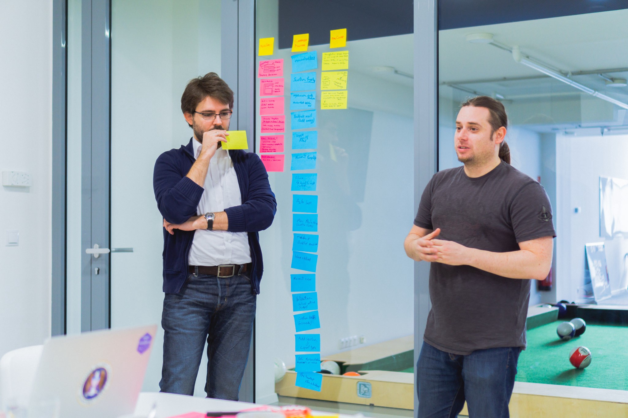
Wrapping up this research session, we presented what we thought were good bits in the competitor product to the other groups, by collecting these ideas on sticky notes and talking about them.
In hindsight, this was not the best way to show off what we learned: when you talk about user interfaces, having some visual examples helps communicating the concepts. The others had a hard time imagining interfaces and flows without screens — so next time, our presentations will be more visual.
“How Might We…”
Closing the day, we established the main challenge — the overarching problem this product is going to solve. We did this by asking the ultimate “How might we…” question — for example, “How might we enable our users to make the best content to engage their customers?”.
By simply composing and saying this question out loud, we got ourselves a common cause. A problem that everyone in the room can get behind cracking.
Day 2: Sketching
It’s Wednesday, and the team is ready to use the information gathered yesterday to start coming up with groundbreaking ideas.
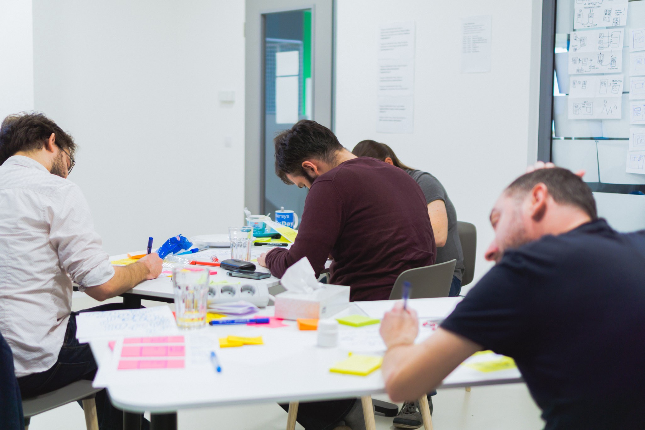
Workshop Workouts
Surprise! We started off this day by doing some physical and mental exercises. I swear, next time I’ll come to these creative workshops wearing sweatpants.
As weird as these exercises might seem, they really help fire your brain up and get those creative juices flowing.
“How Can We Solve…”
On the first day, we declared the primary mission of the product. Based on that, together we came up with further questions which tie into that main problem. Breaking down the main problem into multiple, smaller chunks helps us getting concrete answers — and killing these smaller issues one by one, we eventually deliver the solution to the main problem.
The User Journey
Based on all we know, we started drawing the user journey — from the very beginning of the process (i.e. the user taking a seat in front of the computer) to the very end (i.e. the user’s action brings revenue to their business).
Sketching this journey together helped the team compose and see the holistic workflow the user should go through.
Crazy Eights
We picked out a discrete segment in the journey, did some mind-mapping about what we have in our heads, and then a Crazy Eight focusing on that. What is a Crazy Eight? Well, you have to draw 8 sketches for the selected part of the journey. What’s so crazy about it? You have 5 minutes in total— so about 40 seconds per sketch.

At first, Crazy Eight felt, well, crazy — coming up with ideas so rapidly and in such a small amount of time is frustrating and tiring. But in the end, we got some really nice ideas out of it.
Crazy Eight might feel forced and pointless, but the disposable nature of sketching under such time pressure can result in some very fascinating ideas — you can’t afford sitting on something for too long, you have to keep the ideas coming and coming and coming.
Storyboarding
We dug even deeper, and defined the essential processes in the picked segment. Two people were making three-panel storyboards for the same flows — so the outcome was six storyboards for three different stories.
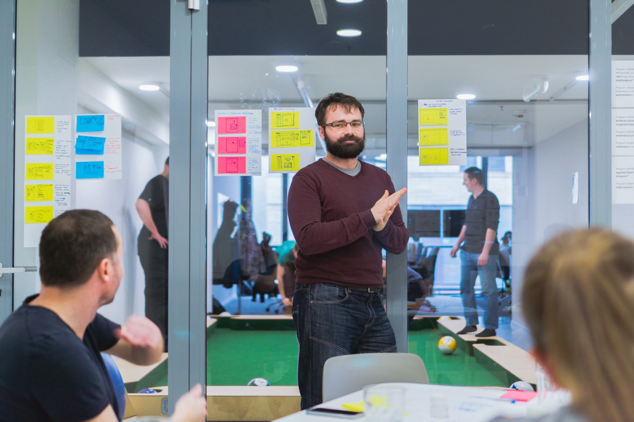
We presented our stories to the others, and started discussing the solutions we chose, when suddenly…
Debating
A heated debate sparked about how our users would approach certain problems in their workflow. Even though we had the journey pinned down, the exact solution about certain problems remained divisive — naturally, team members with different expertise approached these issues from an alternative point of view.
Assumptions like “the user thinks like this” and “they don’t care about that” were thrown around, and right then, right there, we had no research to confirm or deny any of these statements. So we made a list of these assumptions, waiting to be researched.
This highlights the importance of workshops like the design sprint: without this, these conflicting ideas would’ve remained unspoken, and only surfaced later on during the actual product development phase, most likely causing heavy damage to the quality of the product.
Day 3: Sketching (Act II)
Thursday already. Time flies when you’re having fun, as they say.
We decided to go another day with the Sketching phase, as there were still many questions floating around, and many ideas to refine.
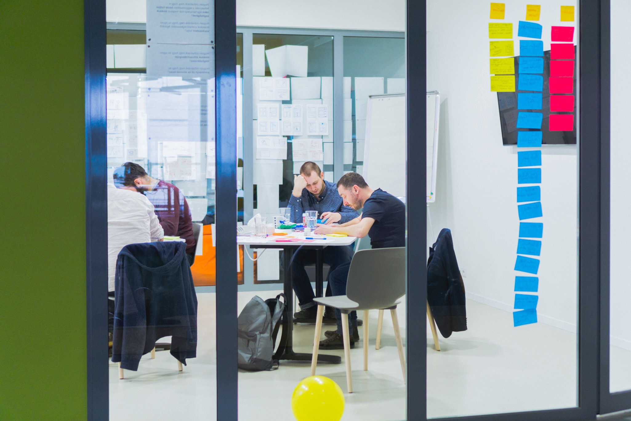
What Do Our Customers Actually Do?
I don’t want to spoil any surprises, but I think I can tell you our product is some sort of editor — our customers make something amazing using the tools we provide. So we looked at some beautiful examples for these creations, made by people all over the world, so we have an idea about what users could possibly want to make utilising our solution.
This part helped us getting closer to understanding the actual needs and expectations of a potential customer, so we could focus on enabling them to reach their goals more easily.
Flow Based on Crazy Eights
Another round of note-taking, another round of mind-mapping, and another round of Crazy Eighting. Ack!
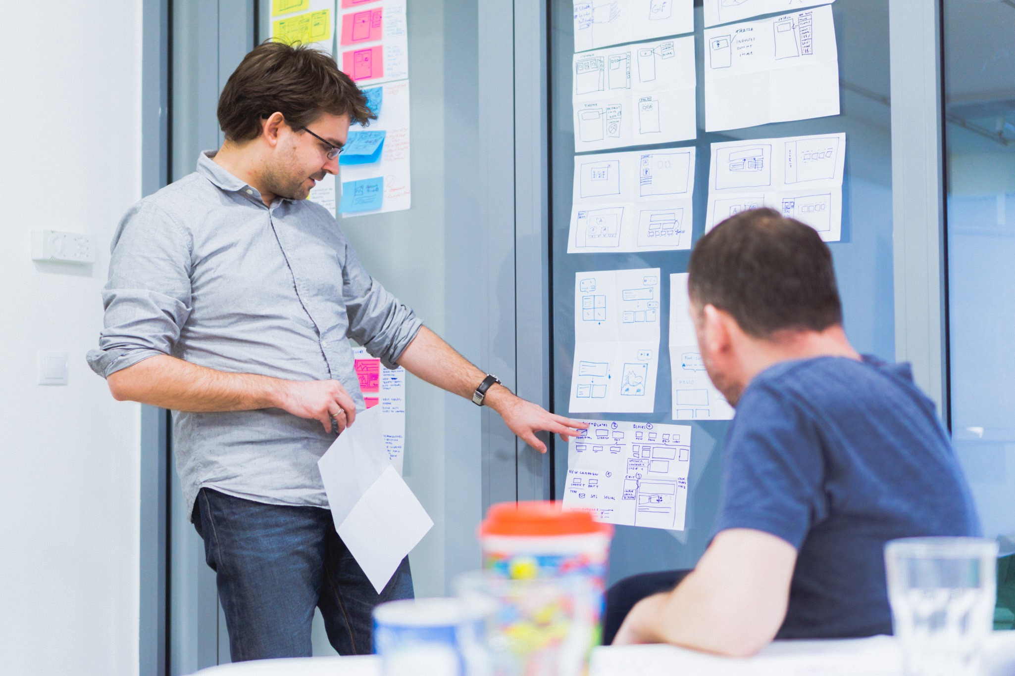
Based on everything up till now, it was time to come up with more ideas for the fine details of our product. But instead of making three-panel storyboards, we decided to actually use these Crazy Eight sketches to create the user flow — from start to finish, we put these sketches on a timeline, to see exactly when the user would bump into the illustrated interaction.
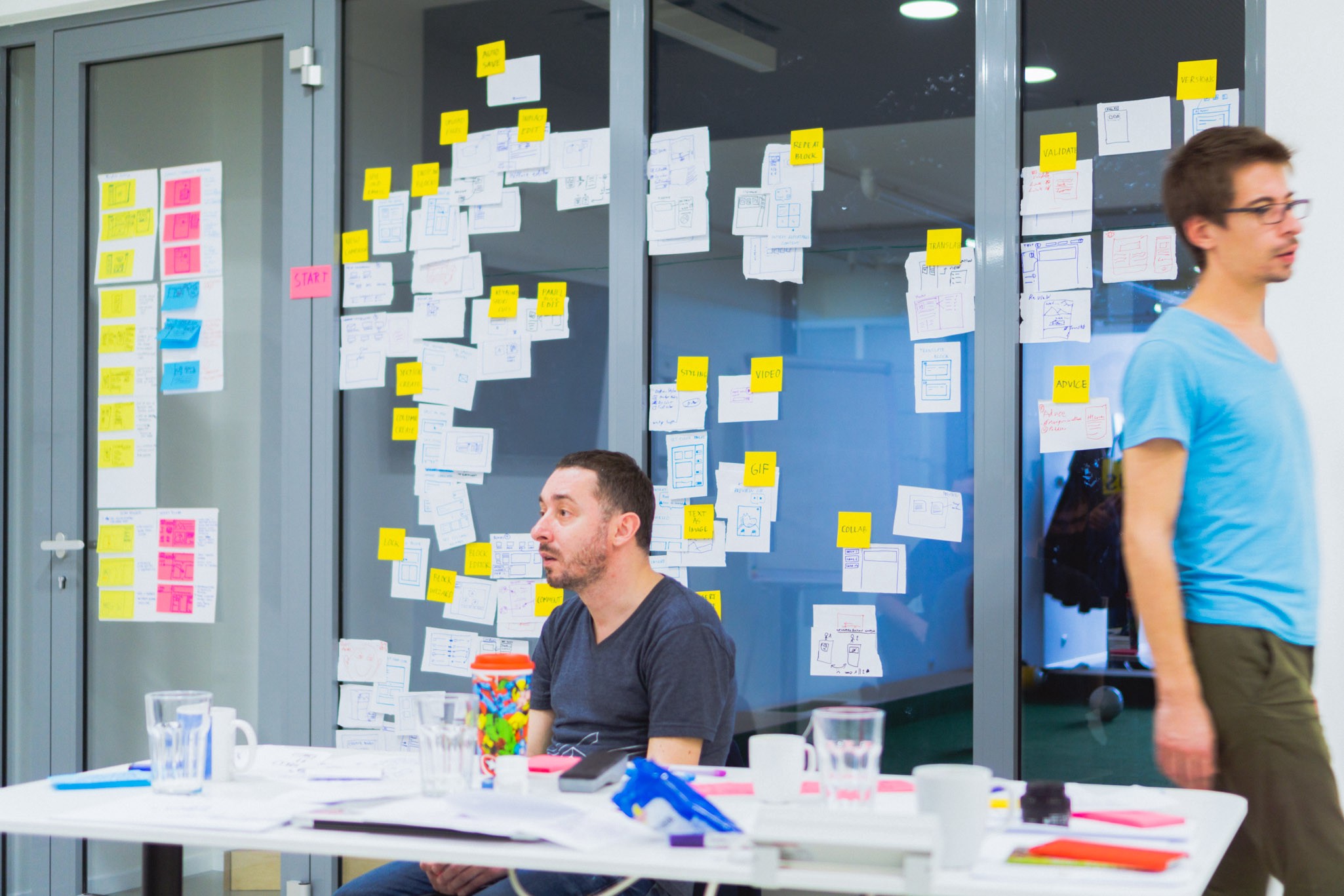
We weighed these sketches to determine which parts are essential, and which are just nice to have. The essential parts got to the top, and we decided to focus on those creating the prototype.
Day 4: Deciding
Friday started off with an intervention: one of the team members got some questions lingering around, so we began with discussing those.
It’s extremely important to listen to these sort of questions and clear things up as early as possible, so everyone can be on the same page.
Research Plan
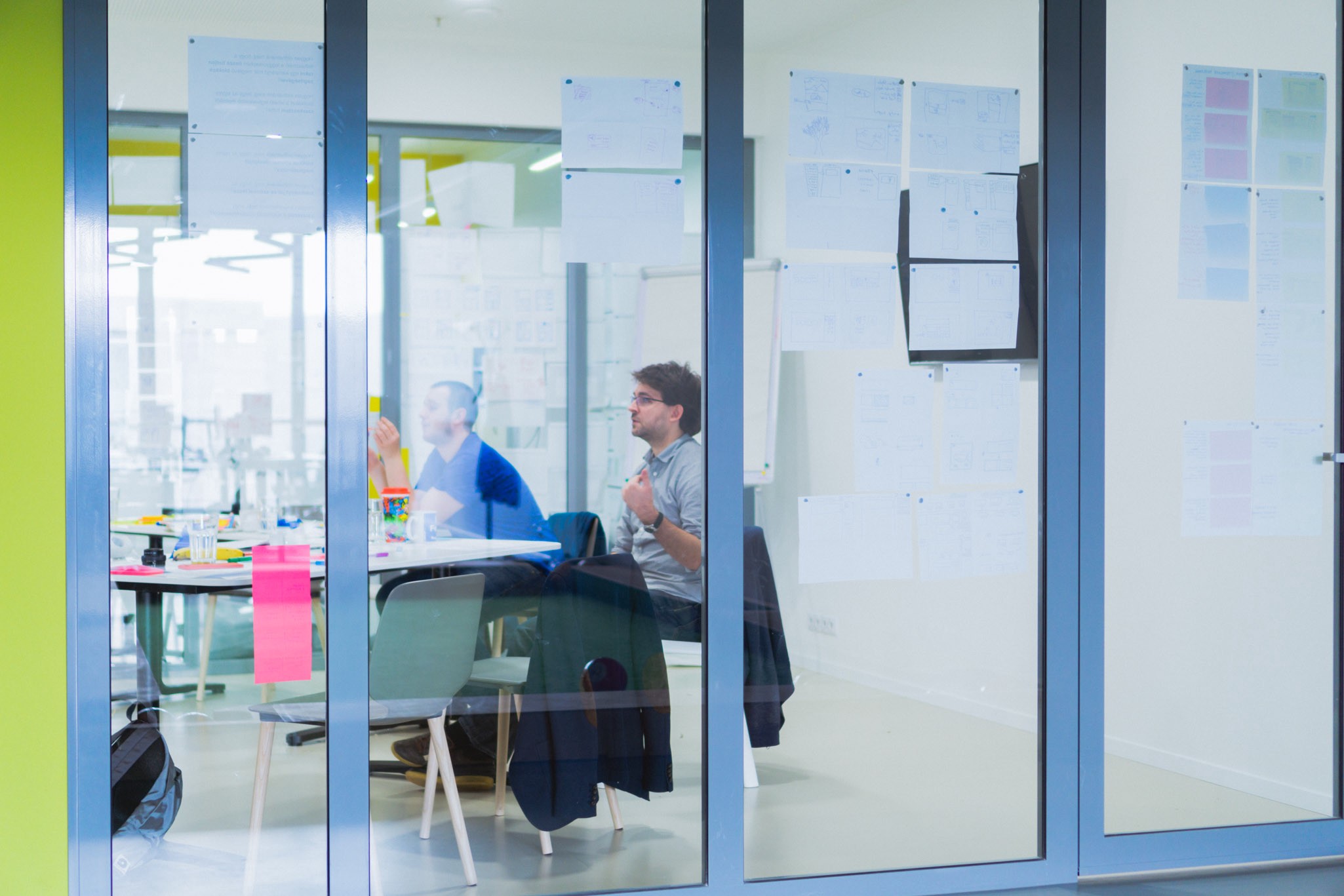
Together we drafted a research plan — the guide to use during the user interview. It contains the necessary questions to be asked to help validate our assumptions, and tasks for the user to achieve using our prototype.
Prototype Storyboard
To wrap up the day — and the week — we started creating the final storyboard based on our research document. This series of sketches are going to be the foundation for the prototype we’ll be building on Monday.
We started discussing the steps one by one, dipping our toes into the fine details behind the flow and interface bits — what goes where, which icons to use, how to name the labels. These were still broad ideas, but defined enough that not many questions remained unanswered.

At last, we felt like we have a concept we can all genuinely support.
Day 5: Prototyping
It’s everyone’s favourite day of the week: Monday. And it’s time to drop the markers and sticky notes and push some actual pixels.
Thankfully we already had everything we needed to create the prototype (the journey, the storyboards, the ideas for interactions), so the sprint team disbanded, and the UX-ers took over to apply the finishing touches.
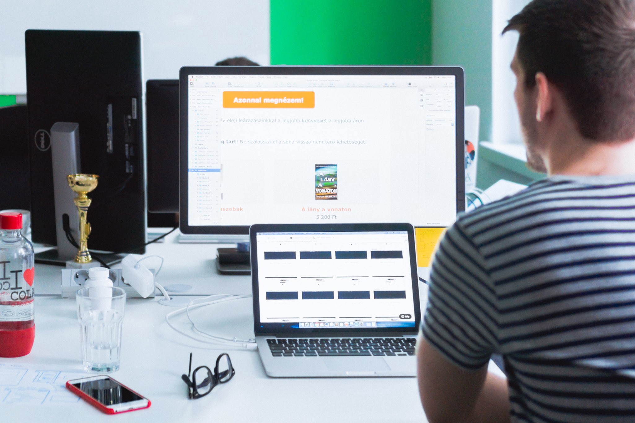
We were considering creating the prototype in Keynote, using UI assets from Keynotopia, but ultimately we decided to create the graphics in Sketch — as we already had most of our UI elements created there — , and make it interactive in InVision.

The whole high fidelity, clickable prototype were made in mere 5 hours. Both Sketch and InVision enable designers to work swiftly, and they are incredibly easy to master — so we highly recommend this combination if you need to bake a prototype in just half a day (or even faster if you add a lot more coffee and sugar in the mix).
Day 6: Test
It’s Tuesday, and it’s the big day: we’ll see our baby in action. Or well, the prototype of our baby. Our protobaby.
Miraculously, we managed to recruit four users for interviewing. They aren’t actually our customers, but they could be — they’re in the market we’re aiming for, and they all had at least some experience dealing with something similar to our product.
The facilitator took care of the interviewees: he guided them thru the warm-up questions and the tasks they had to complete on the prototype. These sessions were recorded, so we can always check back if we’re unsure about a piece of information.
In the other room, most of the sprint team were watching a live video feed of these events, taking notes. Observing the user’s actions and thoughts, as the facilitator marvellously drove the interviewees to think out loud.

It was incredibly satisfying to see our ideas and solutions validated, and soul crushing to see some of coolest concepts fail miserably (note to self: properly communicating with unlabelled icons is a real science).
But overall, we were happy with the results. The users could accomplish their goals neatly, and they liked the prototype — and we had a short list of things to fix and enhance.
Overtime: Iteration and Summarising
A few days later we’ve run an iteration cycle on the prototype, picking some low hanging fruits, busting some quick wins and, well, just making it better altogether.
We quickly tested the improved prototype and made notes about the new discoveries.
At the same time, we were already busy writing reports about the Design Sprint (including this article), so we can present the results and findings to the management and the product team as soon as possible. This happened in the form of multiple presentations.
We showed off the prototype and the user interview findings to the CEO — and he loved them.
The team together managed merge the CEO’s and our own visions, and poured them into a tangible form. Even if the user-facing UI is just a small part of the system we will be creating, and needless to say, there are still many questions up in the air about the fine details of the product — but now at least we have the cornerstone for the developments to come, and a clearer picture of the final product our customers would love using.
Now for the hard part: turning our concept into reality.
What We Did Differently
Our hands were forced not to play by the rules. Some things worked out just fine, some were less than ideal:
- Instead of having a whole week, the Design Sprint started on Tuesday, and ended on Tuesday the week after.
Even though the weekend pause was refreshing, it felt like the workshop was torn into two distinct halves. Running the sprint in one go would probably have a better sense of closure. - We couldn’t afford spend eight hours a day on the sprint, we had to compress everything into four hours a day.
In retrospect, this is the farthest you can get from the optimal setup. Those intensive four hours really capped our productivity for the rest of the days, so practically the only sane choice is to do the 8 hour-long crunches. - The prototype itself wasn’t made by the whole team, but by a few selected people.
We don’t feel like turning the final storyboard into a prototype would require the whole team. - We made a flow based on Crazy Eight sketches, instead of drawing discrete storyboards.
Because of this, some really wicked-but-neat ideas made it into the “nice to have” backlog. - The facilitator was also practically part of the product team.
This made it hard for him to distance himself from product discussions and focus solely on the workshop itself.
Takeaways
Running this Design Sprint we’ve learned a ton not just about the methodology per se, but also found some important bits in the product development process:
- The Design Sprint is an excellent method to get the whole team on the same page about the product and realise the grand ol’ shared understanding.
- It will also bring up questions that otherwise might just get lost in the communication maze of a multi-team environment.
- Testing your ideas with real users gives you a powerful bargaining chip when it comes to pushing concepts through the stakeholders, and it can also be an eye-opener regarding things that don’t work as well as imagined.
- It is demanding. You’re going to be absolutely exhausted. You won’t be doing much else during the week…
- …But in the end, everyone will get a solid foundation for the product that can be used throughout the development phase.
So as you might’ve guessed, we feel like this Design Sprint was extremely useful — we’ll be definitely picking it up as a habit to build amazing foundations for our future products.
Editing: Csongor Fabian, Peter Polgar. Special thanks: David Barkoczi, Andras Fincza, Robert Sipos, Viktor Somodi, Gabor Szabo, Zsanett Toth
