Design Jargon
Designs, wireframes, prototypes. It’s not uncommon to see people use these terms interchangeably, or simply in the completely wrong context. And yes, my dear friend—it happens even in your office.
Sometimes you see full-blown visuals called “wireframes” simply because they still contain some soon-to-be-replaced dummy text. You can even hear sharpie sketches on sticky notes referred to as “prototypes”. It doesn’t help that other industries use these jargons in surprisingly different ways.
But fret not, I got you covered — let’s talk a bit about the subtle but majestic distinctions between all these alien words.
What is “Design”?
“Design” is possibly our biggest culprit in this technobabble mayhem, sitting on the same bench as “creative”.
People tend to use the word “design” synonymously with “visual”, “pretty” or, quite incredibly, even “art”.
We cannot blame them: that’s how culture implanted the term “design” in the heads of millions; some intangible noun that implies fashion and decorativeness.
Let’s see what the Oxford dictionary has to say about the word “design”:
A plan or drawing produced to show the look and function or workings of a building, garment, or other object before it is built or made: he has just unveiled his design for the new museum.
An arrangement of lines or shapes created to form a pattern or decoration: pottery with a lovely blue and white design.
In the context of making digital products, however, the term “design” should be an overarching concept that not only affects the look of the product — in digital product design, that’s mostly the UI — , but also how it works under the hood and inside the cockpit.
Design is the well thought-out intention behind every single decision that made the product become the way it is.
To put it another way, code is designed. Workflows are designed. Visuals are designed. Even, miraculously, marketing strategy is designed.
So with that in mind, the terms we’ll be discussing ahead are part of the product’s design, but are not solely the product’s design.
What’s a “Wireframe”?
This one is fairly straightforward, thankfully. Let’s take a look at what our trusty dictionary says:
“An image or set of images which displays the functional elements of a website or page, typically used for planning a site’s structure and functionality.”
Basically,
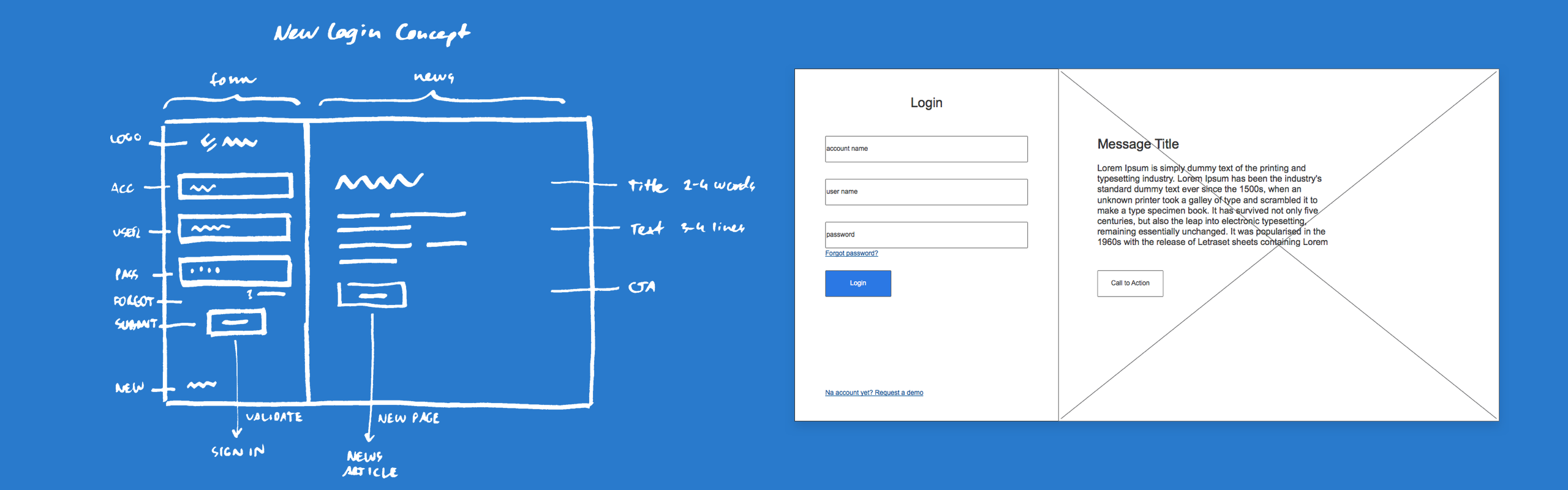
A wireframe is the draft of the interface’s structure.
It can be made in a purpose-designed wireframing tool like Balsamiq, or any sort of application in which you can work in graphics—even Powerpoint or Keynote. And guess what: you can even draw legit wireframes on paper!
As the name implies, wireframes are usually made out of mere lines to indicate the placements of different elements, but it’s not uncommon to see some colours, mock text and placeholder graphics thrown into the mix to make the wireframe more lifelike.
The main charm of wireframes is that they’re quick and cheap. And because of these qualities, they are also disposable—so you won’t be forced into marrying a horrible idea simply because “that’s how it turned out”.
It’s far less expensive to throw out a wireframe that stinks and create a better one from scratch than to do the same thing with close-to-completion visuals. So start with quick and dirty wireframes, and explore design concepts until you find some which seem sane enough to be raised to the next level in fidelity.
Wireframes might also imply visual design solutions and functionality, but they’re low-fidelity and rough by nature.
This roughness can be both a blessing and a curse: wireframes are not as awe-inspiring as fancy visuals, and sometimes our colleagues and/or managers might have a hard time seeing the same thing we see (“Why is all the text in Latin?”)—but again, it’s all worth it if we can filter out conceptual dead-ends early on.
As long as everyone who’s viewing the wireframe are on the same page regarding its purpose, there shouldn’t be any problems — but that purpose has to be communicated properly to non-designers. Don’t expect everyone to just know why this “design” looks like it was drawn by a teen applying for some sort of architecture degree.
What are ’em “Mockups”?
This is where it gets interesting:
“A model or replica of a machine or structure, used for instructional or experimental purposes: a mock-up of a steam locomotive cab. [As modifier]: a mock-up prototype.”
(One red flag in this description should be the usage of “prototype”, but let’s just roll with it.)
So,
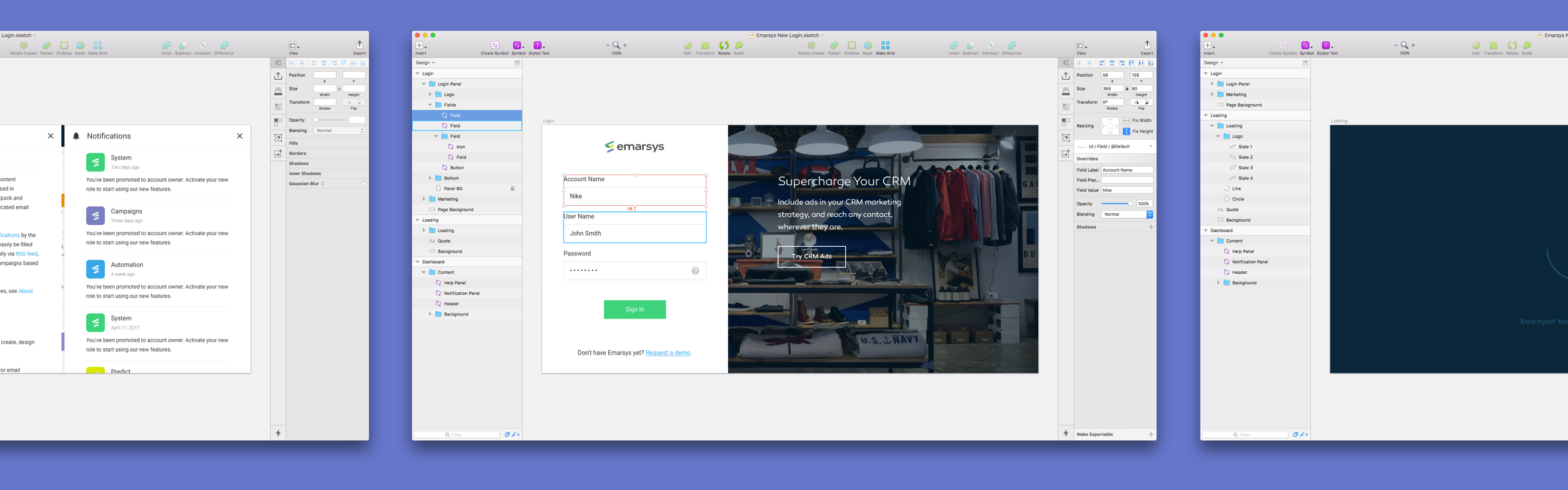
A mockup is a high-fidelity visual that might even represent the released product — but it’s not.
Maybe because it’s not functional. Maybe because it’s just the fragment of what the product needs to be. Or maybe because it’s just not approved by the higher ups. Either way, the intention behind a mockup is to be close-to-completion enough to be directly usable in shipping the product.
In the case of a simple web site, a mockup could be jpegs of every page. If these pictures are approved and someone builds the site out of them — boom, we got the product.
To further illustrate this, here’s the second definition of “mockup”, used in the press:
“An arrangement of text and pictures to be printed: a mock-up of the following day’s front page.”
So as you can see, a mockup is just the step before that cocoon of a jpeg morphs into a beautiful butterfly of a released product. It’s a high-fidelity, expensive visual that could potentially be implemented right away. But again, it’s not. Because it’s just a mockup.
(youtube: https://youtu.be/uPrf1ozjB34 caption: It’s alive! It’s alive! (Not really, but a fancy illusion nevertheless class: padded)
What about “Prototypes”?
This is the year 2017, and everyone is all about prototypes. Because of that, it’s high time to know exactly what “prototype” means:
“A first, typical or preliminary model of something, especially a machine, from which other forms are developed or copied: the firm is testing a prototype of the weapon; the prototype of all careerists is Judas.”
(lol)
But here’s the nasty catch: do prototypes imply visual fidelity? Only hi-fi mockups can be prototypes? Or can you use quick and dirty wireframes to make a proto?
In other industries, a prototype might mean both visual and functional fidelity — like the first assembled, working model of a certain type of car which can be tested and tweaked before mass production begins.
But in our digital product world, a prototype implies functional fidelity rather than visual fidelity. To put it another way:
A prototype is all about illustrating the behaviour of the product.
And yes, ideally the prototype also should look as close to the final product as possible, working with high-fidelity mockups. But a prototype using low-fidelity wireframes is still a prototype, because prototyping is the designers’ perfect tool to explore behaviour and functionality in design without the investment of making an actual product.
And that’s worth repeating: even though turning something into a prototype is more expensive than simply sketching on paper, it should still be a lot cheaper than making the actual product. If the numbers don’t reflect that, something went terribly wrong.
Take the included video above for example, which is supposed to prototype the flow, animations and some behaviour — using Sketch and Flinto, it took me only an hour or two to threw it together. Implementing the same design in code probably have costed a lot more man-hours.
What’s more: a prototype doesn’t have to include all the things a product will be able to do. You can make smaller scope prototypes focusing on a small set of behaviours and functions to see how that bit holds up.
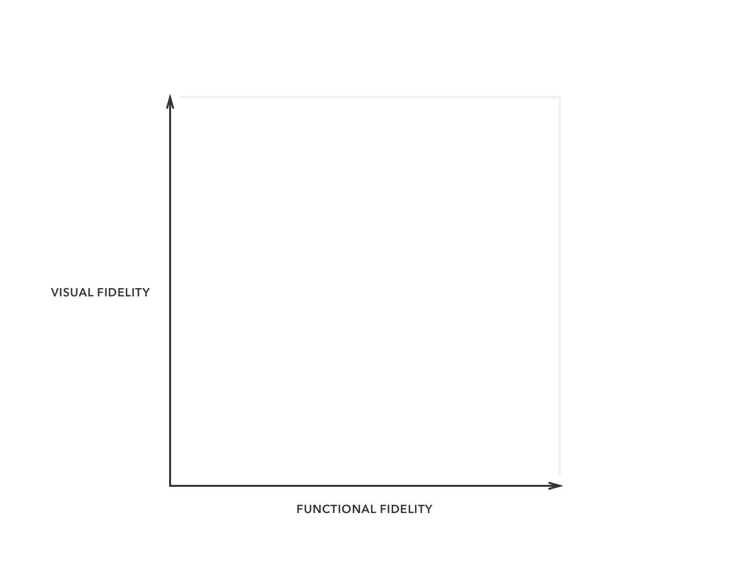
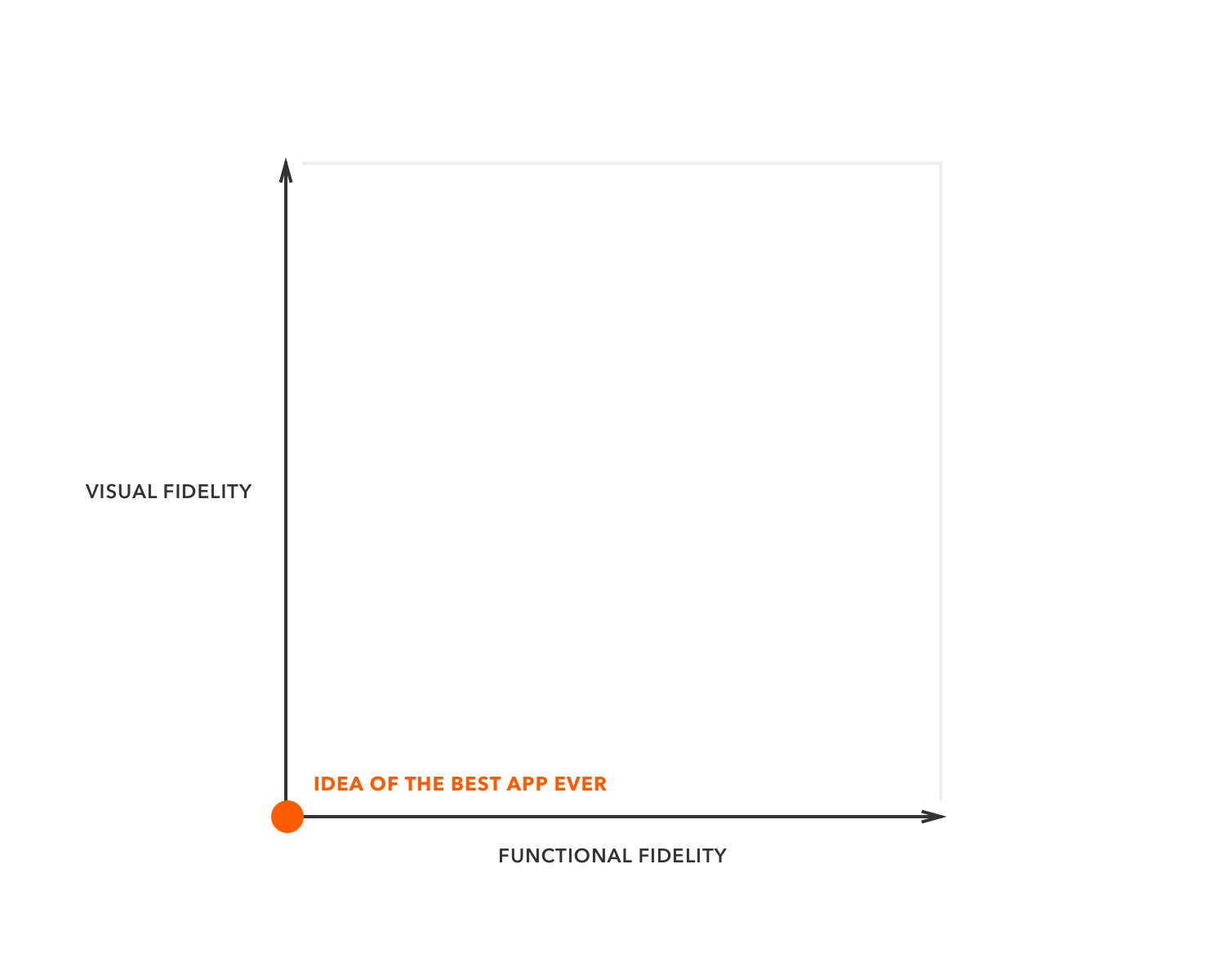
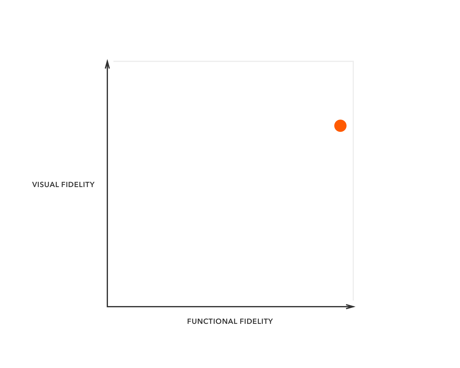
Tangent: Functional Fidelity vs. Visual Fidelity
If you read through this article this far, you might feel a bit uneasy about all these terms — as they’d have this certain foggy aura of confusion and chaos around them?
You bet! All because they don’t exactly operate on the same axis: mockups and wireframes are about visual fidelity, while prototypes are about functional fidelity.
So maybe the best way to illustrate these concepts is to place them on their own respective axes in a handy coordinate system, like so:
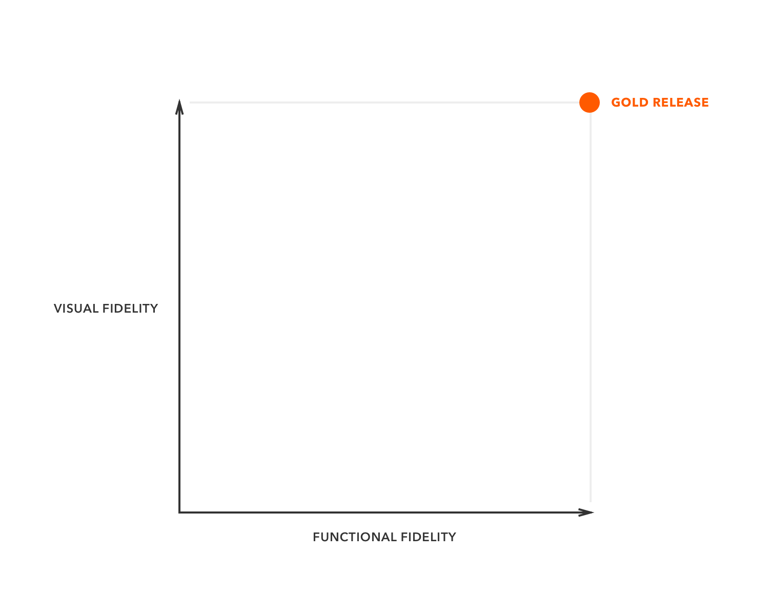
Now, we could say the “final product” sits on the top right corner of this area, because the “final” product has full-blown visuals and complete functionality. Except, of course, if you’re “agile”:
And we could put the first ever napkin sketch of your million dollar app idea right at the bottom left:
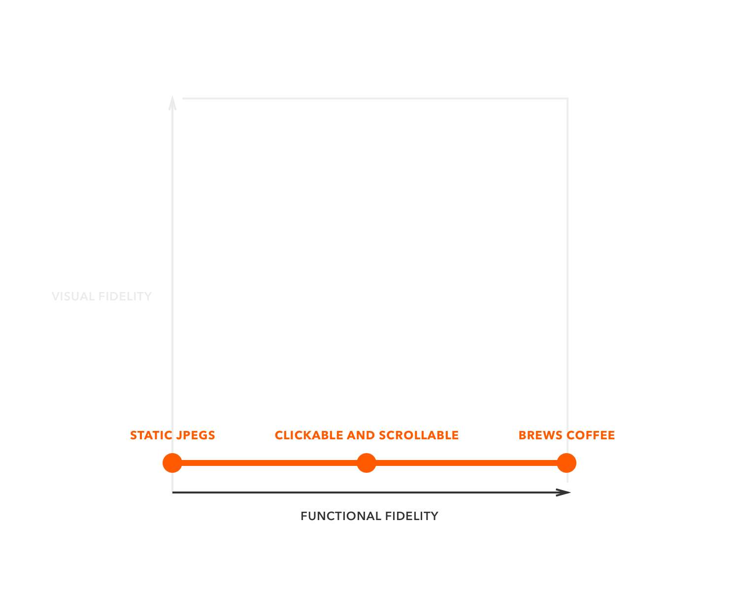
Prototypes take the “functional fidelity” axis. Depending on how deep and detailed that prototype, we nudge our crosshair to the right:
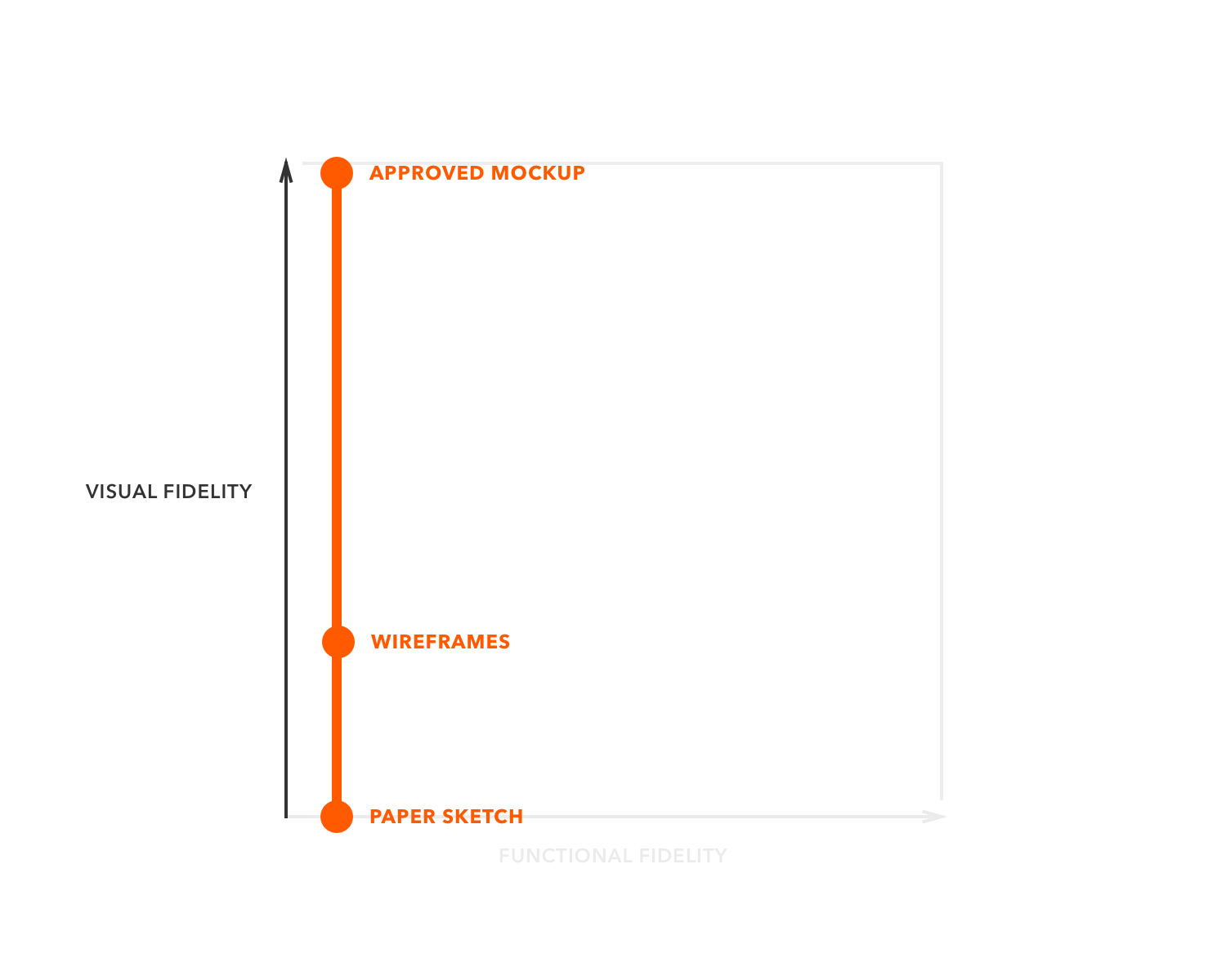
Wireframes and mockups take the “visual fidelity” axis — the former being at the bottom part, while the latter conquering the top:
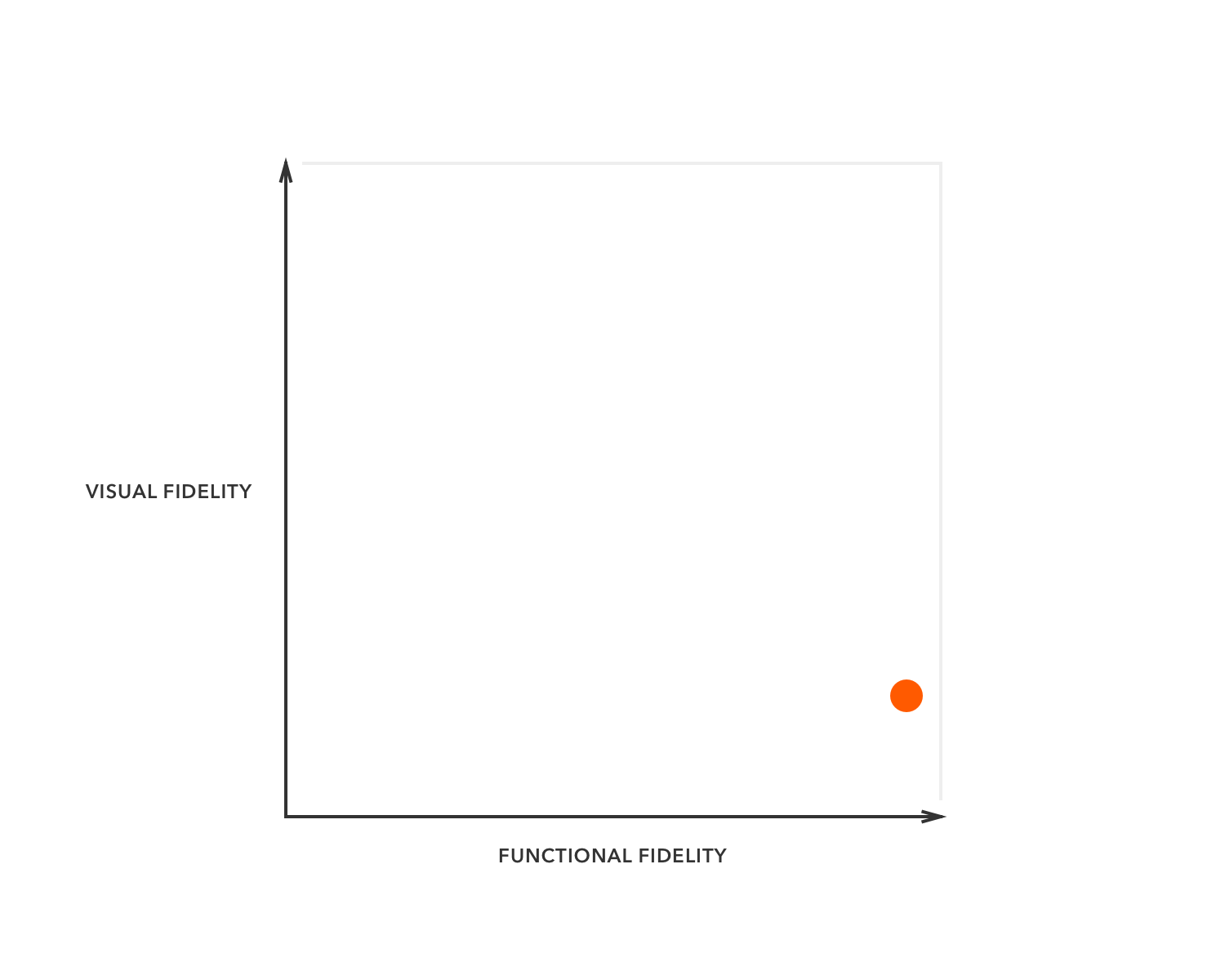
And now we can all mix and match: a prototype that covers the whole product, but with hastily glued-together wireframes? There you are:
The same prototype three weeks later, with fancier visuals? Here’s your update:
What to Do With This Newfound Knowledge?
I sincerely hope you found this article at least somewhat useful — so next time you find yourself in the limelight of a design presentation nor product planning, you can call the beast by its name.
Surprise your colleagues by slapping them in the neck with some crystal clear, perfectly unambiguous phrases:
- A napkin sketch? Try “a non-functional, low-fidelity design”.
- A prototype made out of wireframes? Repeat after me: “A functional, low-fidelity design”.
- Discussing that “Final-design-v12-final-v3.jpg”? Maybe, just maybe, refer to it as “a non-functional, high-fidelity visual design.”
Ah, don’t they just roll down your tongue? Anything for the holy semantics!