iPhone 6s
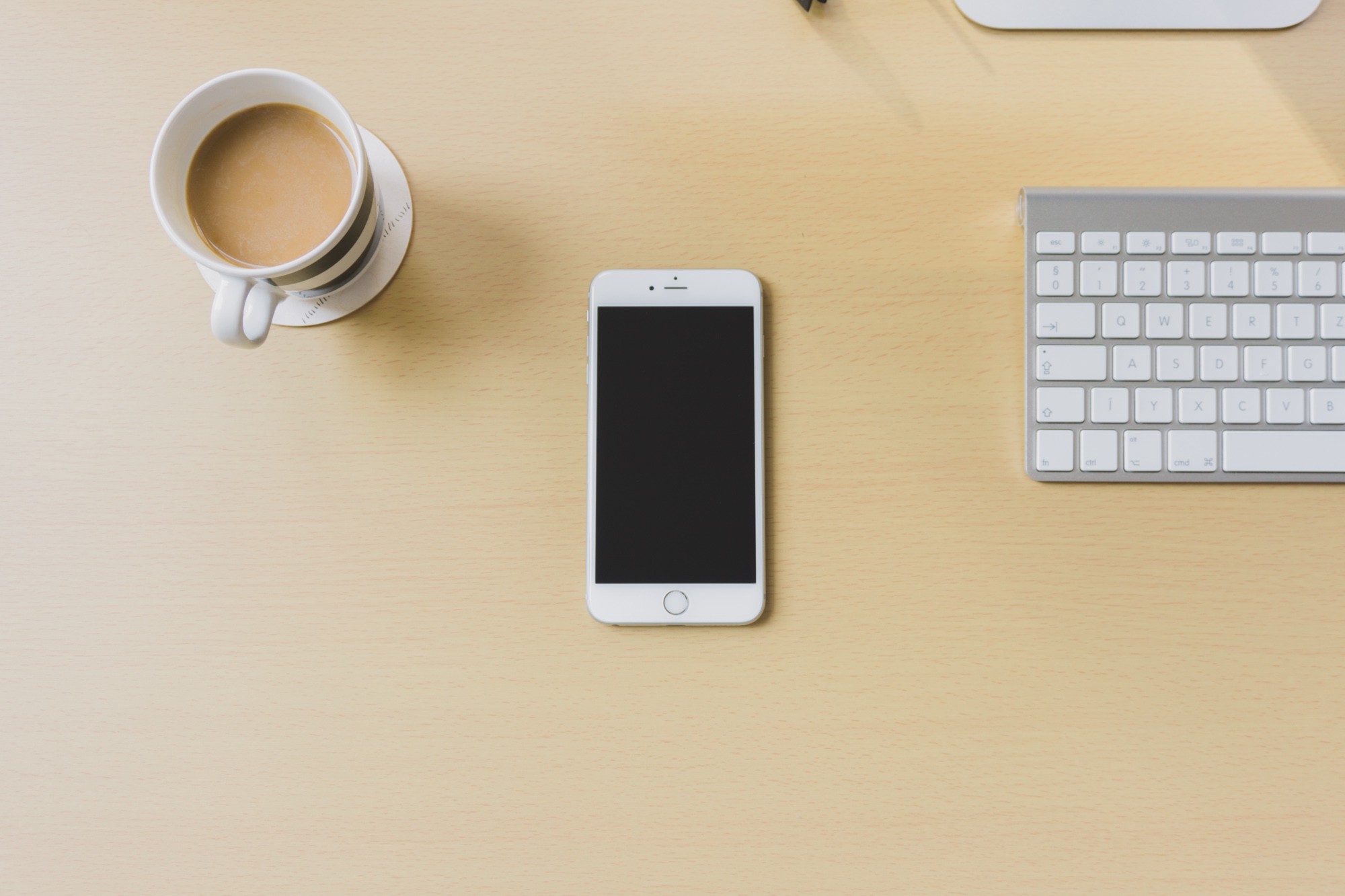
Another year, another iPhone arrives in stores.
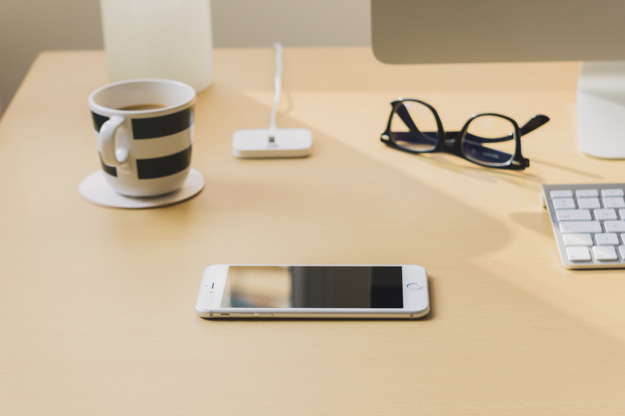
But for me, this year is different. After four long years, I finally did something that lots of folks do annually: getting a new one.
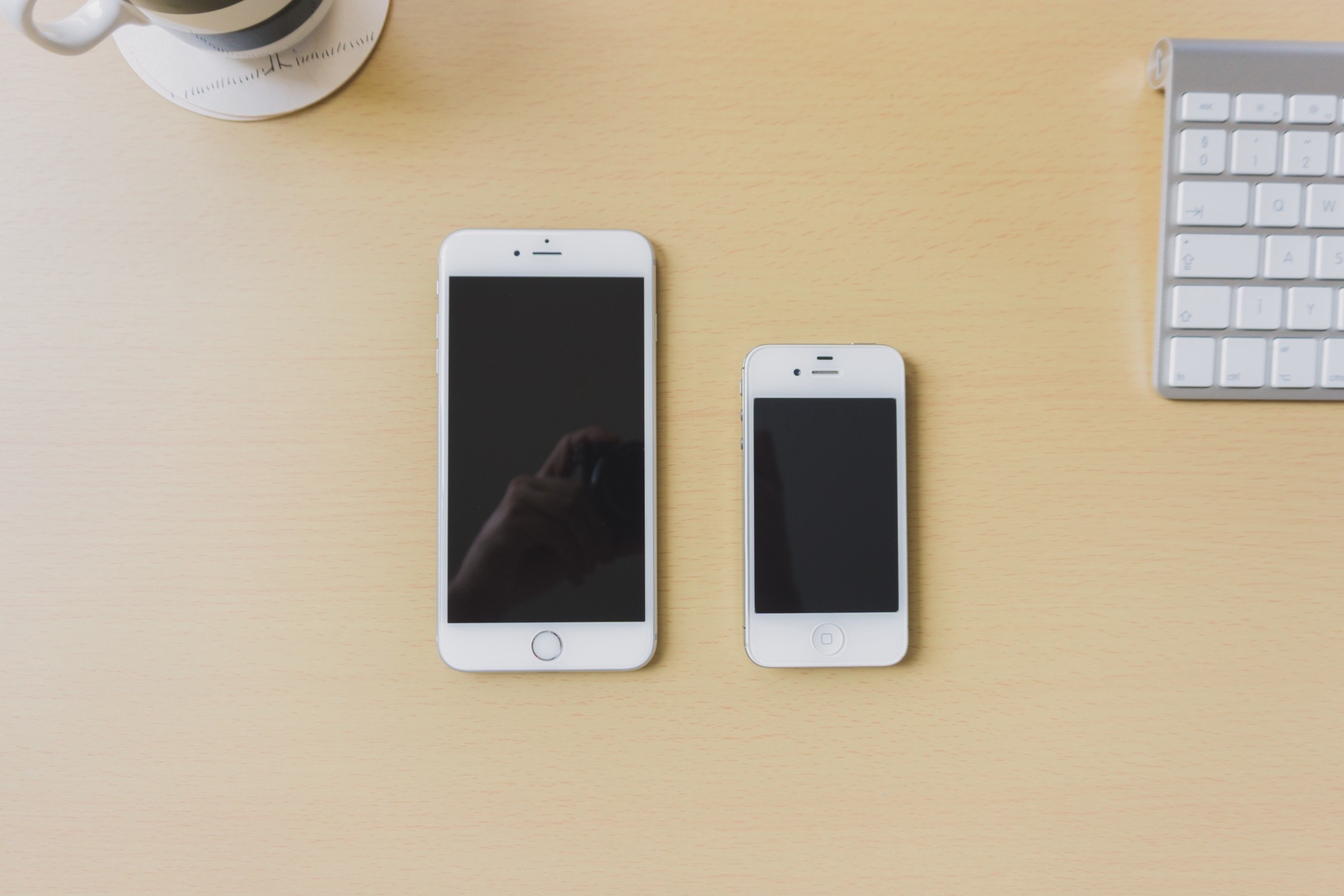
I love my iPhone 4S. Well, at least I did in its first two years. Sadly, the issues brought by iOS 8 made using the phone kind of a miserable experience. Lengthy loads and lot of lags. One of the beloved killer apps of the 4S, the “instant on” camera became just a fading memory.
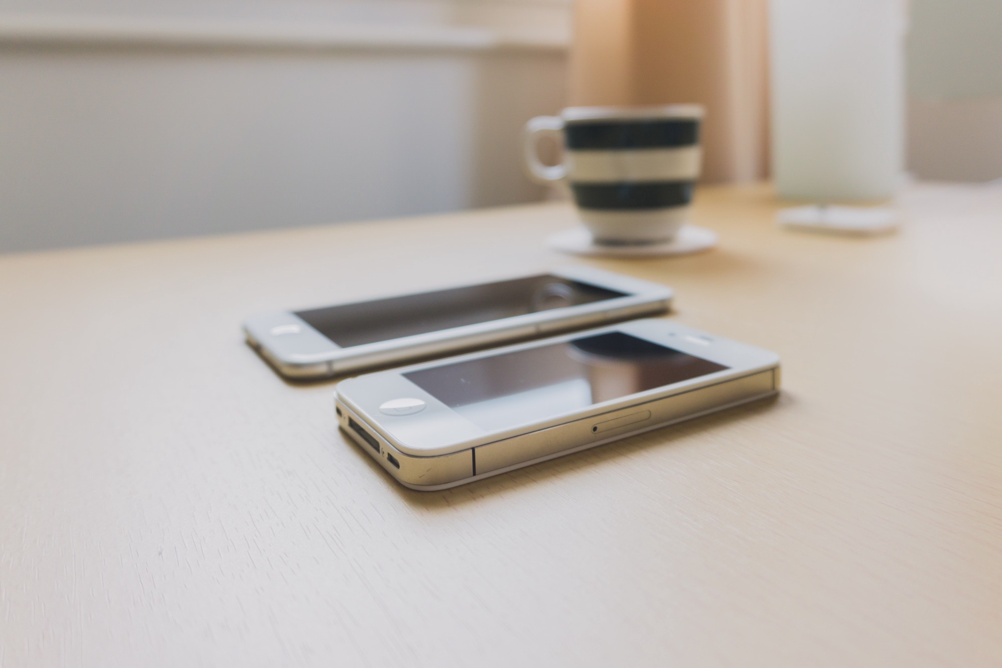
The flaky home button and worn-out battery weren’t helping, either. The iPhone 4S is one of the most aesthetic and fully realised devices I’ve ever owned, but how it provided its functionality felt broken and obsolete. It was time to move on.
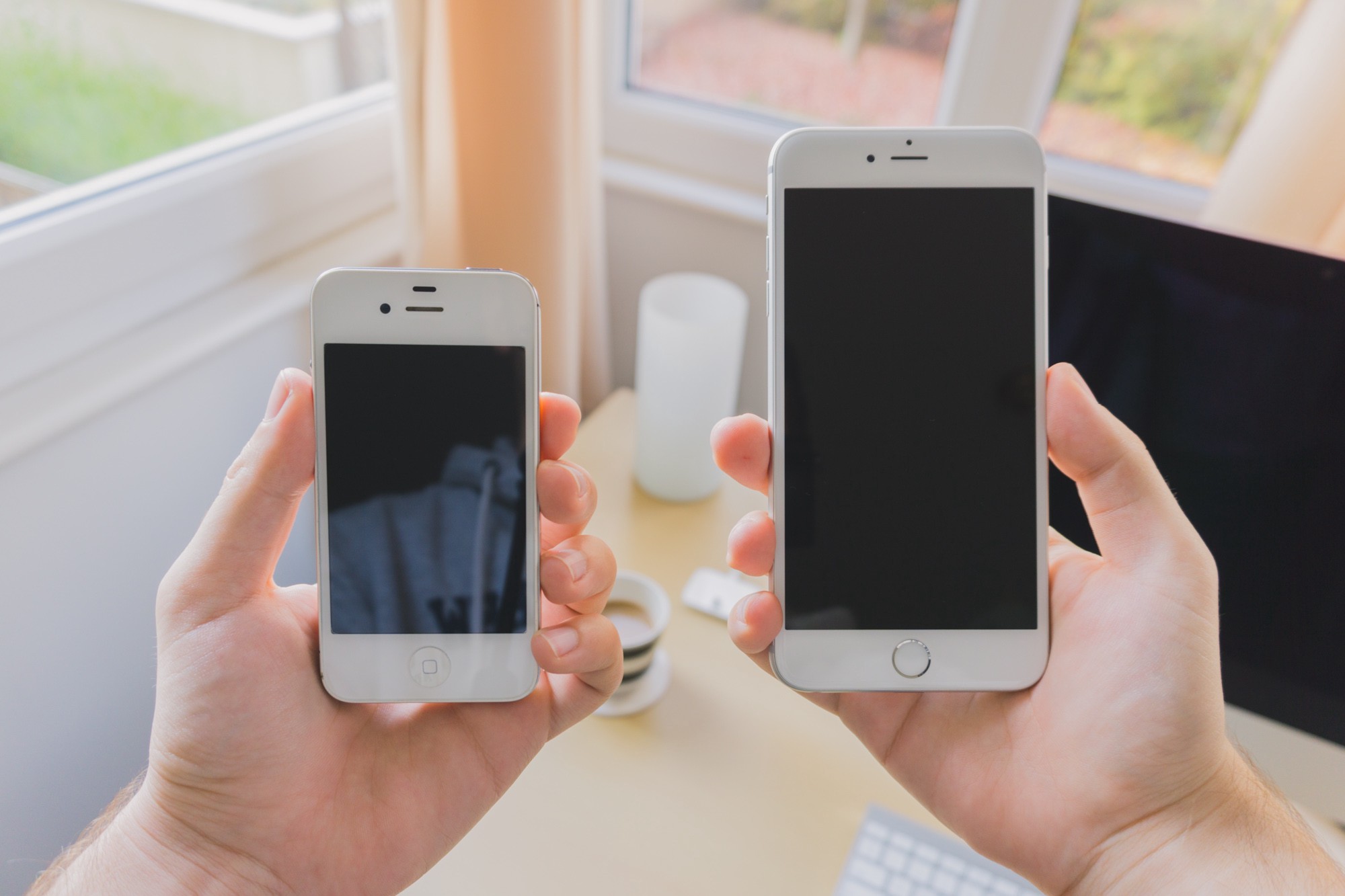
So here I go, from a phone that’s considered miniature these days to one of the most enormous.
We all know the new iPhones come in two sizes: big and way too big. For reasons you’ll see below, I decided to get the latter — and two weeks in, I’m still not entirely sure it was the right, or sane decision.
But if I got the smaller model, I’d have kept wondering whether I liked the Plus more. I’m afraid my soul couldn’t possibly be saved.
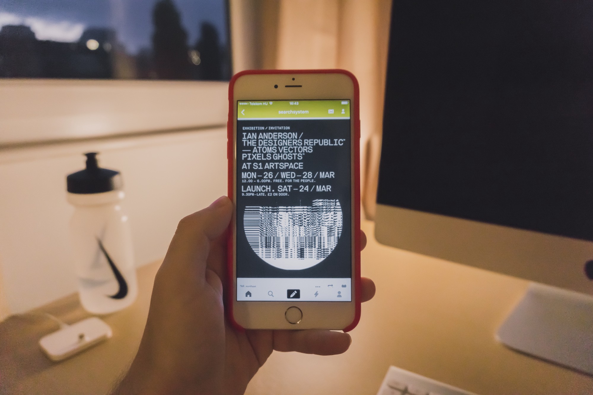
As most people, I don’t use the “phone bit” of “the phone” all that much. Honestly, I use it more like a tablet: to read articles, to browse Tumblr, to chat on Twitter, and to play games. So I figured the larger screen would benefit me and how I use the iPhone. I don’t need a practical phone — I need a superb pocket computer.
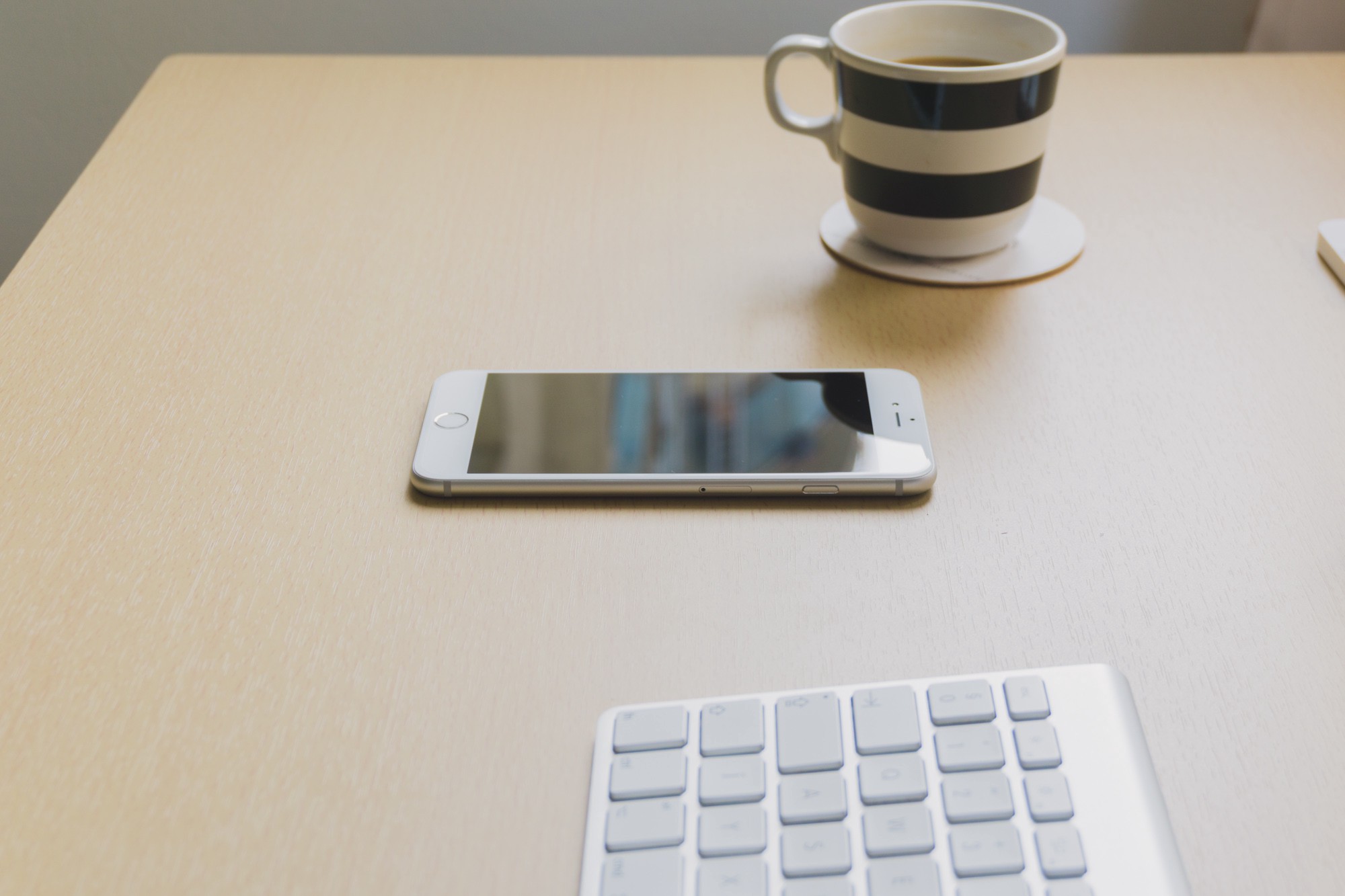
The larger battery, and therefore longer on-time is of course on the list of pros as well. I’m okay with charging my phone every night, but I don’t want any surprises if I ever end up heavily using the phone during the day, or if I forget to plug it in before I fall asleep.
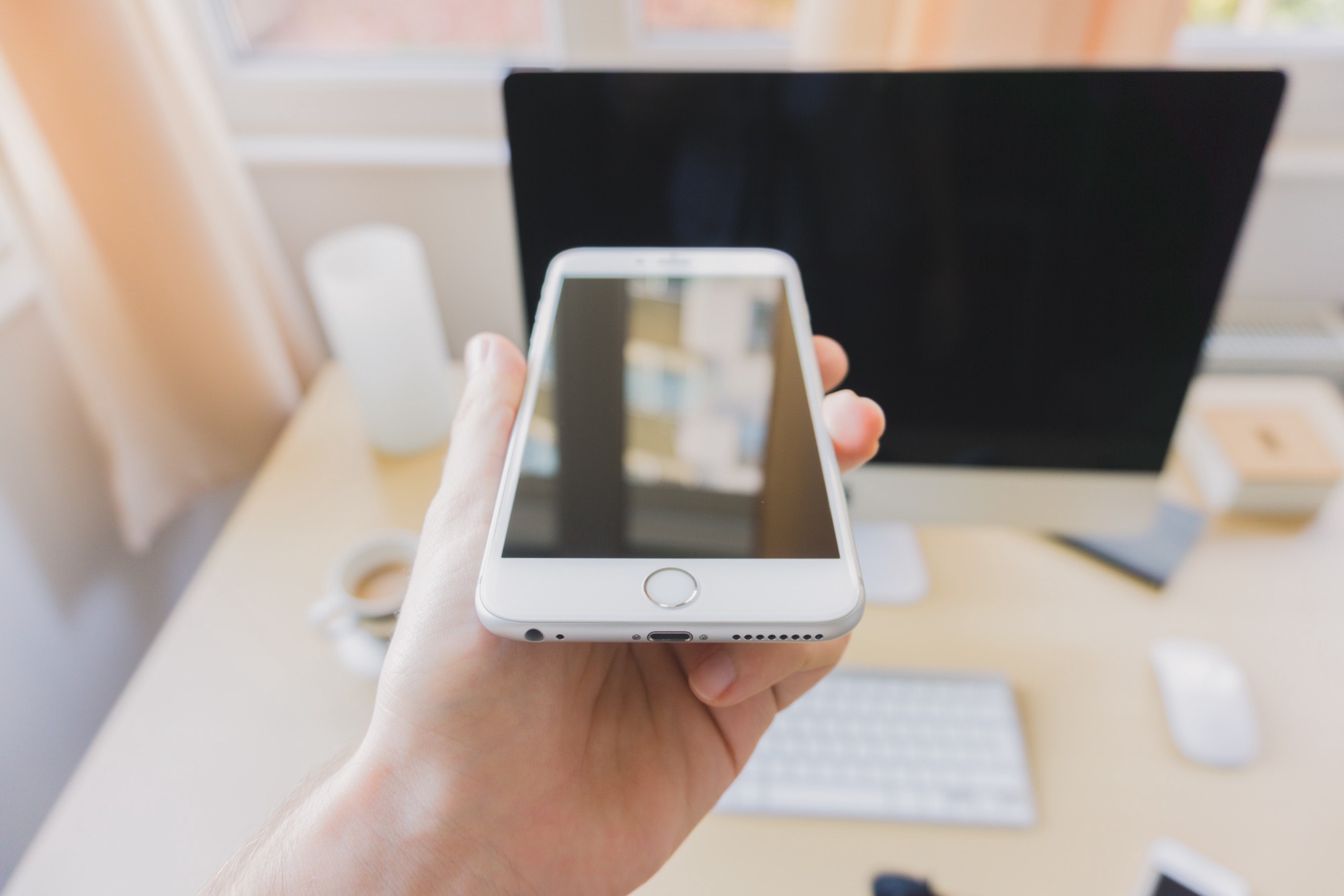
But as we all know, being large has its cons; it’s a hard fit, and even harder to handle.
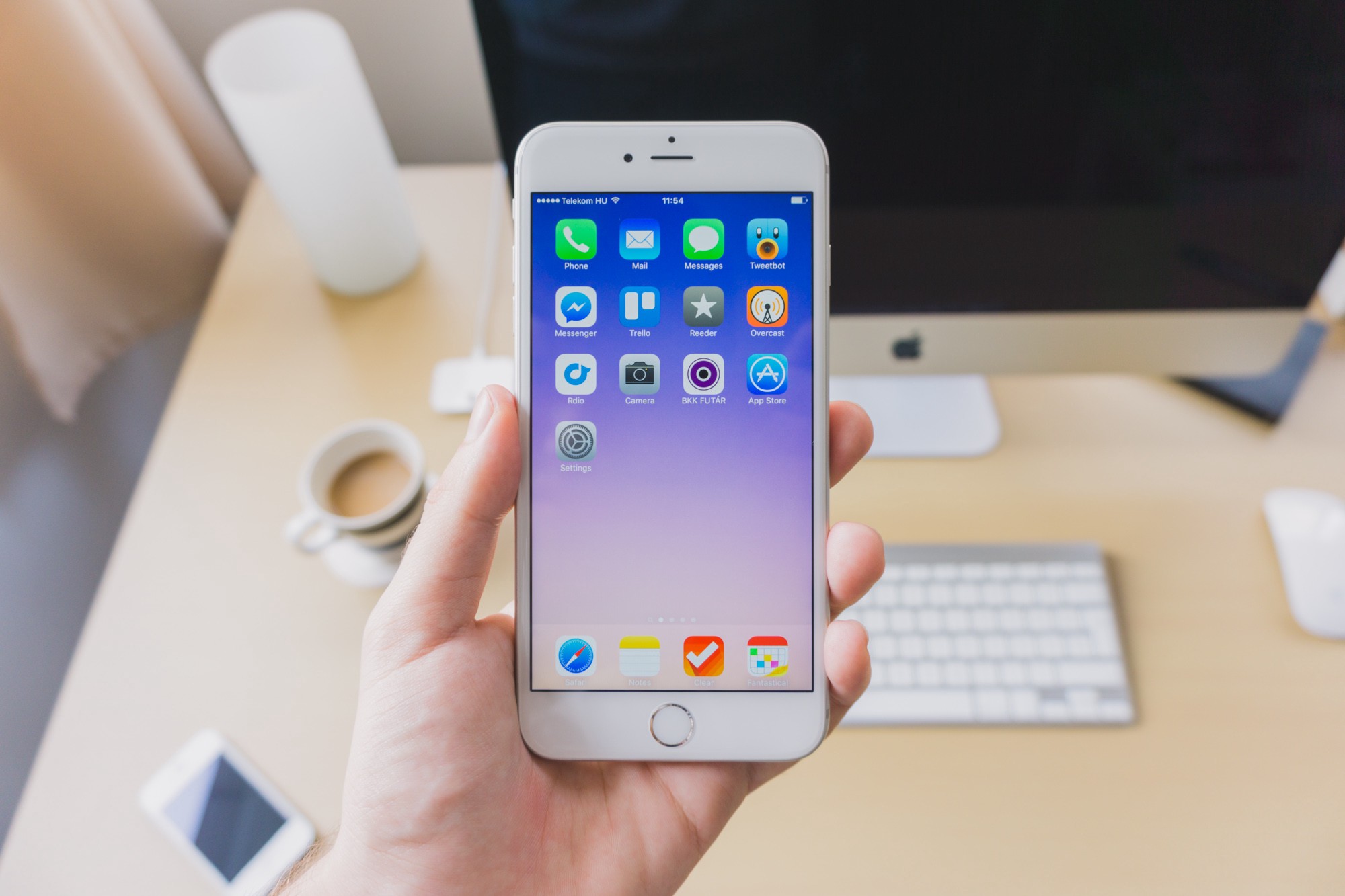
As expected, carrying this beast around is not as comfortable as something smaller, especially if you make it even bulkier by popping a case on it. Without a case, it’s thin enough to slide comfortably in your pocket, alas, it does not disappear—every step you take is a reminder that you have a monster in your pants.
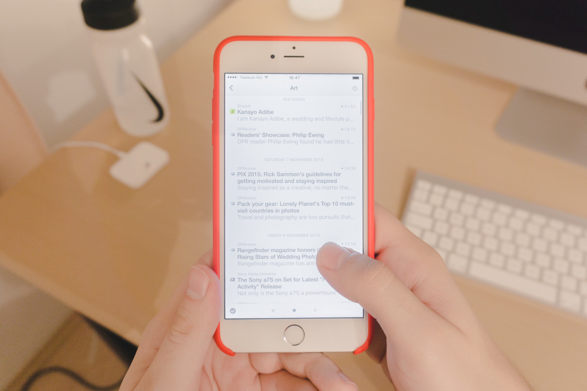
And forget about just single-handing it. Unless you have way too big hands to accompany this way too big phone, you’ll need two to make it work. Which is mostly fine, there’s not a ton of scenarios where both of my hands are occupied when I’d like to play around with the phone — standing on the train would be probably one of those.
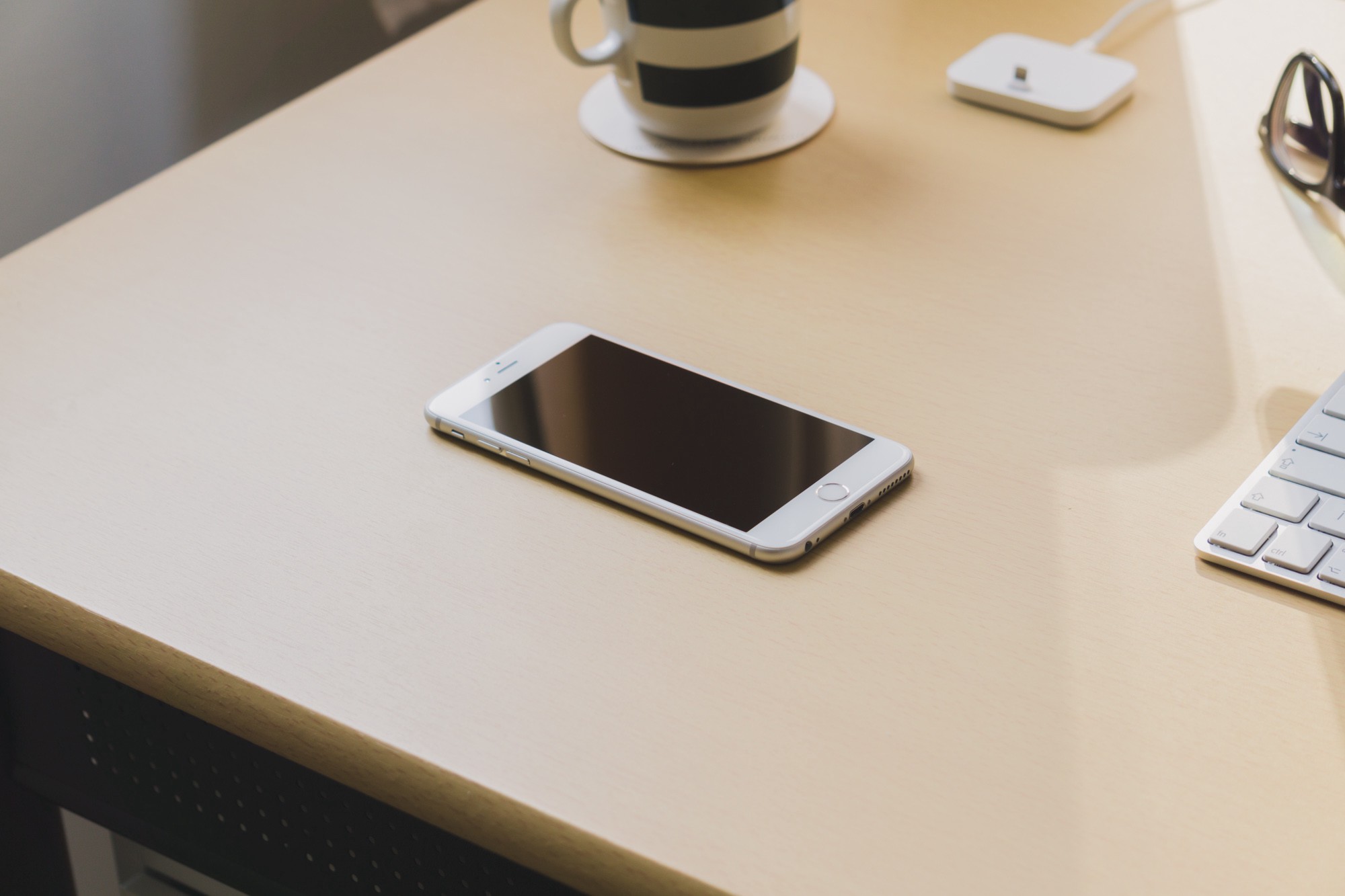
The rounded edges of the device look neat, especially how the front glass hugs that curve. But I’d be lying if I said I didn’t prefer the more boxy look of the 4 and 5. As always, great craftsmanship — but my heart belongs to sharp rectangular objects, sorry.
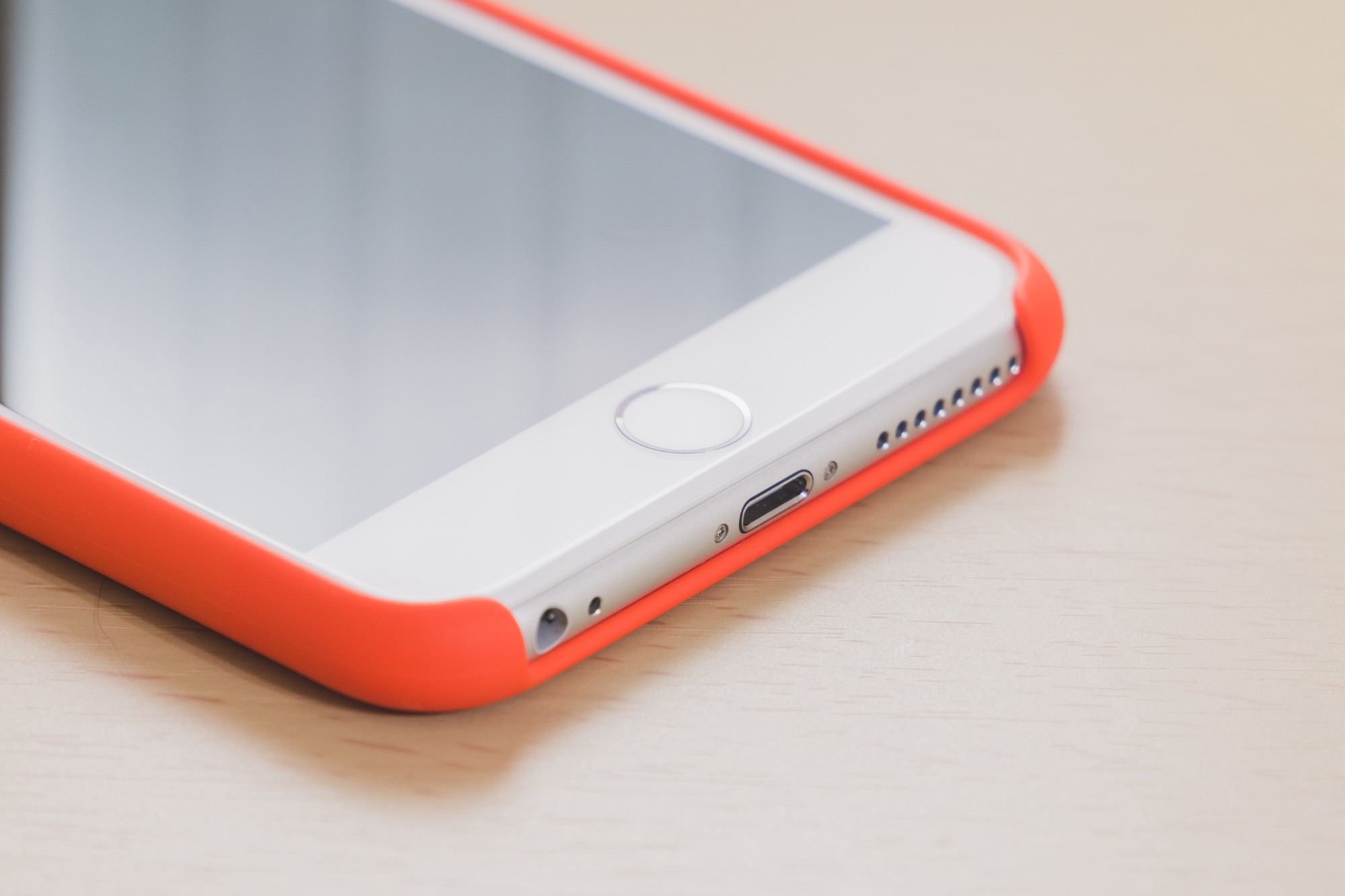
The Touch ID enabled home button still has that shiny, chromey outlining — looks like jewellery, and I’m not a huge fan of that. I found the less prominent look of the home button pre-Touch ID more appealing — it felt less like a tacked on button, and more like an integral part of the phone’s face. But at least, without the gleaming chamfered edges of the 5s, the device as a whole seems less like a garish fashion accessory.
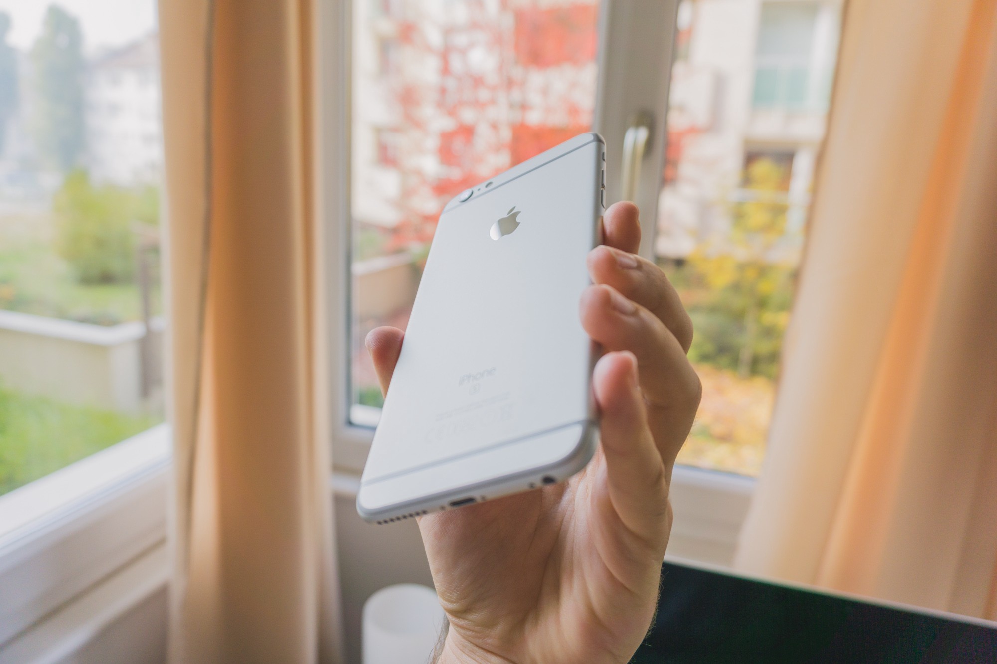
It’s probably not a surprise to hear that I find the plastic antenna lines on the back ugly. I wish Apple could’ve solved this by their engineering magic, but oh well — at least the mirror-finish logo looks neat.
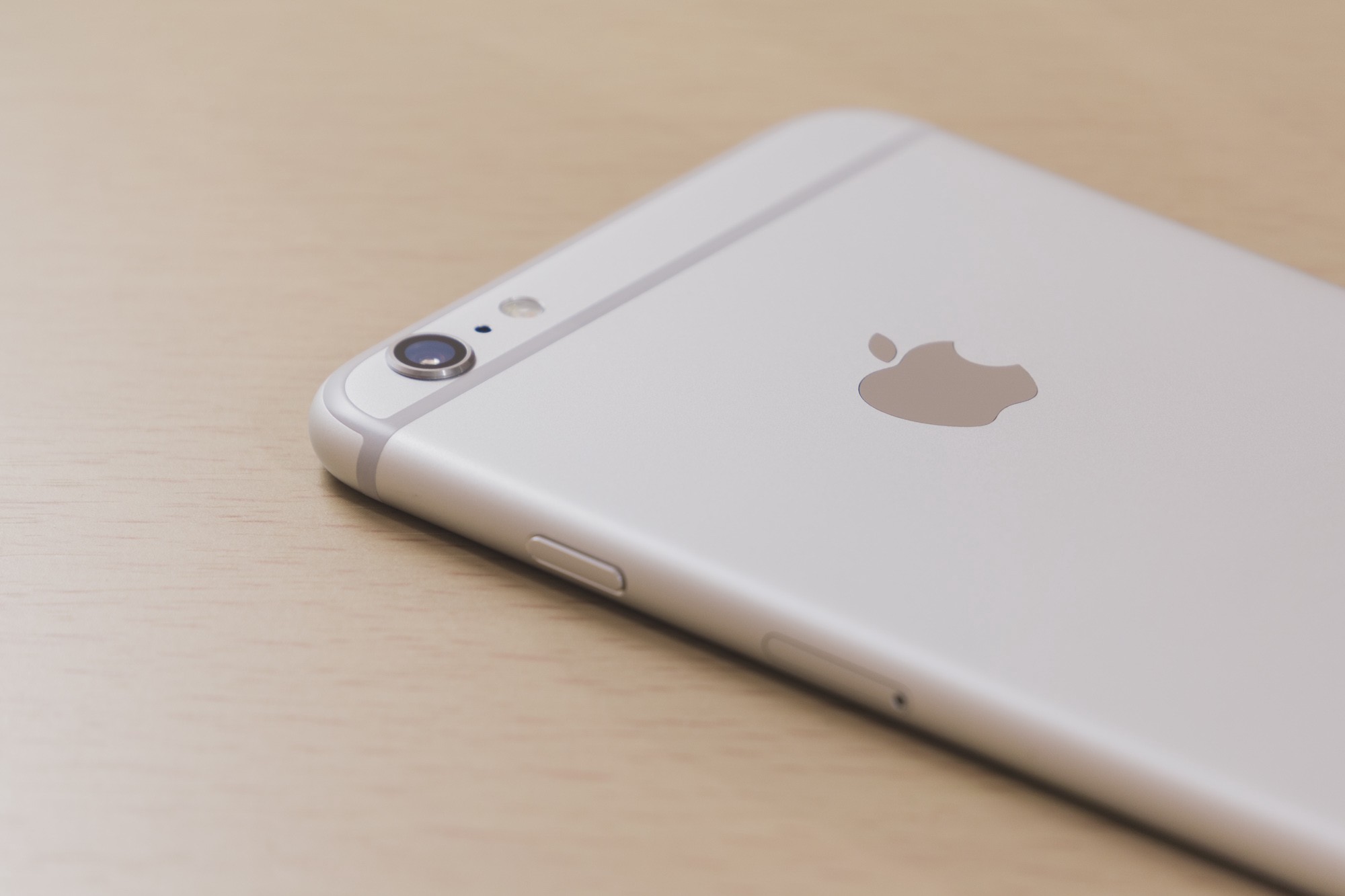
The infamous camera bump. Meh.
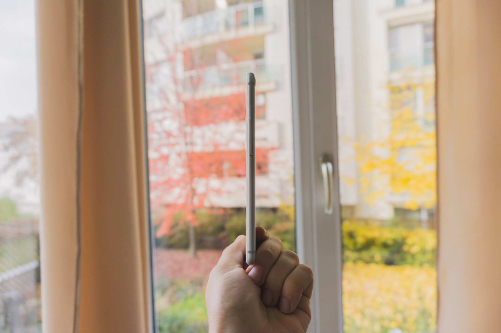
It’s crazy thin though.
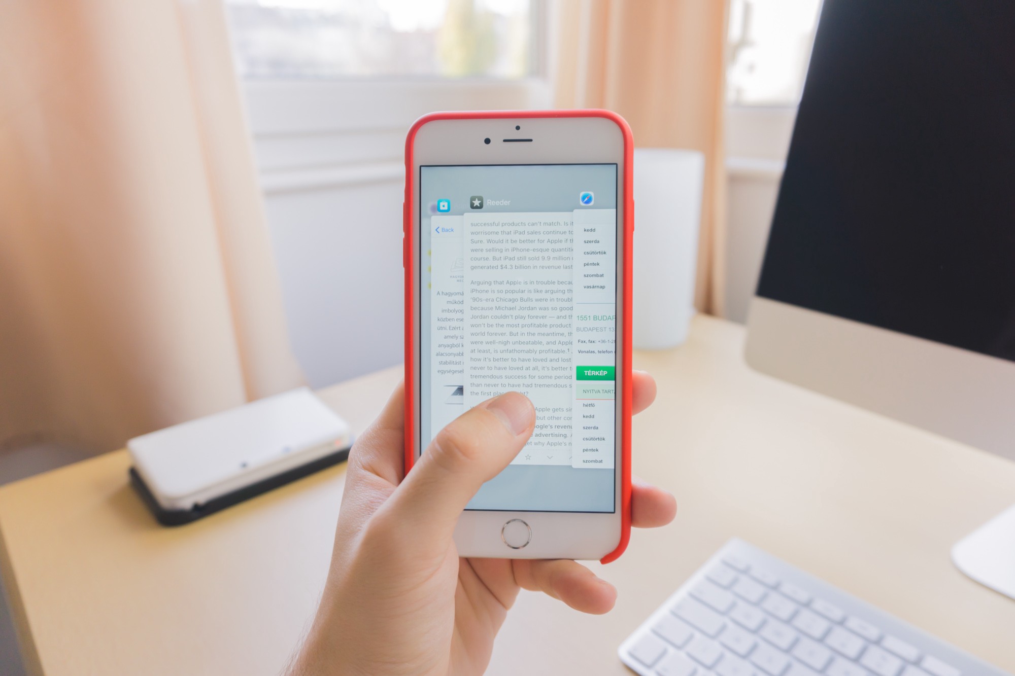
The 6s packs a punch. Apps open nearly instantly, and then they stay open — while the 4S struggled to keep even two apps open at the same time lately, on the 6s you can switch back to an app you used God knows when and continue right off. Benchmarks say it’s on par with laptops from 2011, and honestly that doesn’t even surprise me; it feels like it.
But again, in 2011, the 4S was fast as heck too, it’s the more demanding software that killed it. I’m curious to see how the 6s stands the test of time in this regard.
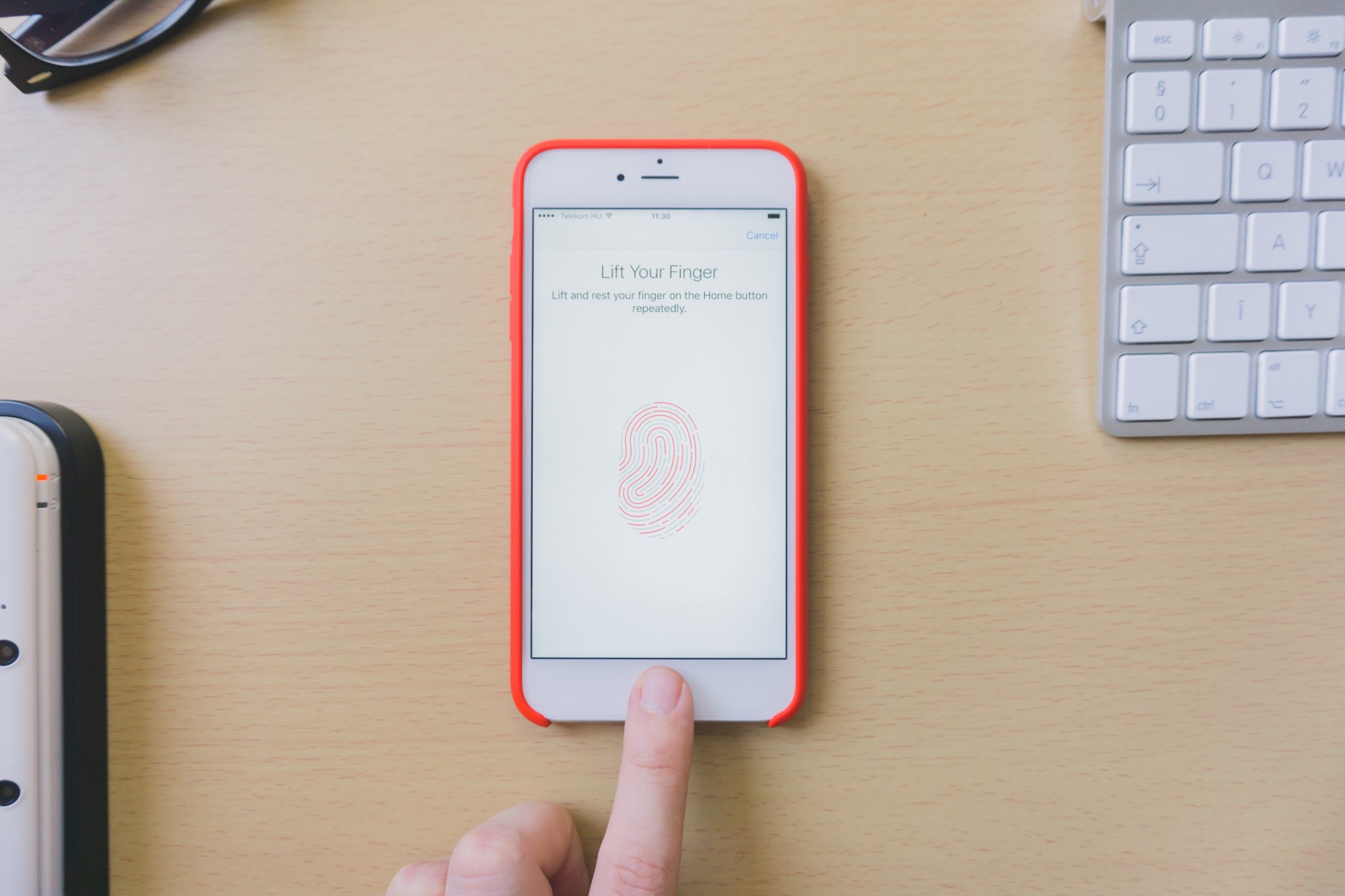
Coming from the 4S, Touch ID might be my favourite new thing. Passcodes and passwords are necessary evils, but reliable and quick fingerprint authentication could complement these mechanisms to make them less of a hassle.
It’s so quick, maybe it’s too quick: you can’t even peek at the notifications on the lock screen if you’re waking the device by the home button, as you unlock the phone instantly.
The optical image stabilisation in the Plus is godsent if you do videos. It’s nearly magical how well it dampens shakes and bumps. Walking or riding a car won’t result in garbage, shaky clips anymore.
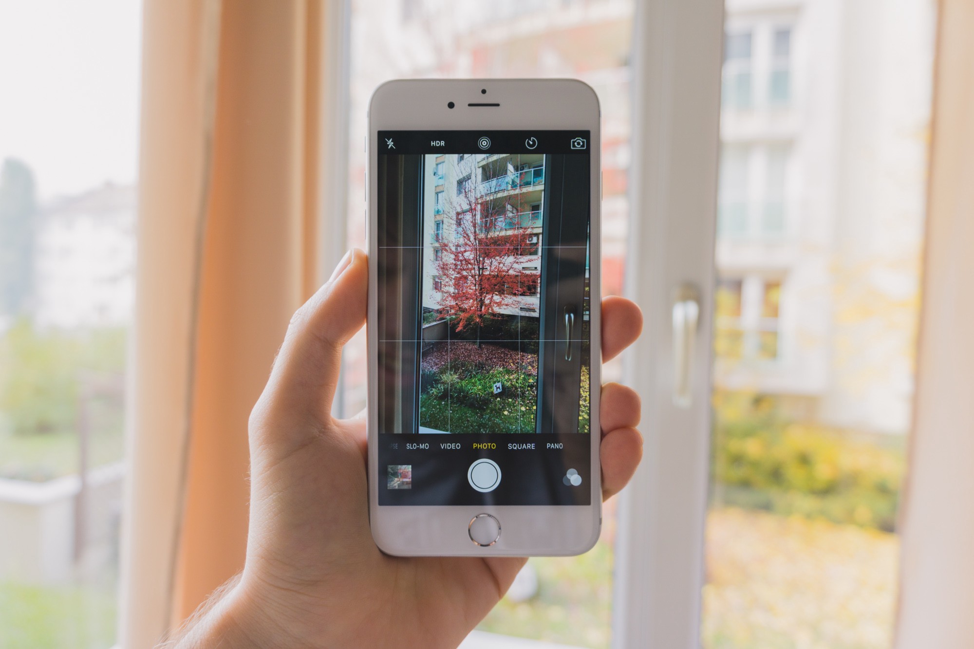
It also helps taking slightly better photos in bad lighting conditions. Alas, the image quality is still not great when you take photos in the dark — the camera misses a lot of subtle details of the ambient light. You’ll still need a camera with a large sensor and fast lens for that. But at least you can ditch your cheap compact camera for good, hurray!




Few photos right from the phone’s camera.
3D Touch is great, but underused. It will probably take a while till developers figure out how to implement it in a meaningful way. For now, even if you just use it on the keyboard to move the cursor around, it’s all worth it.
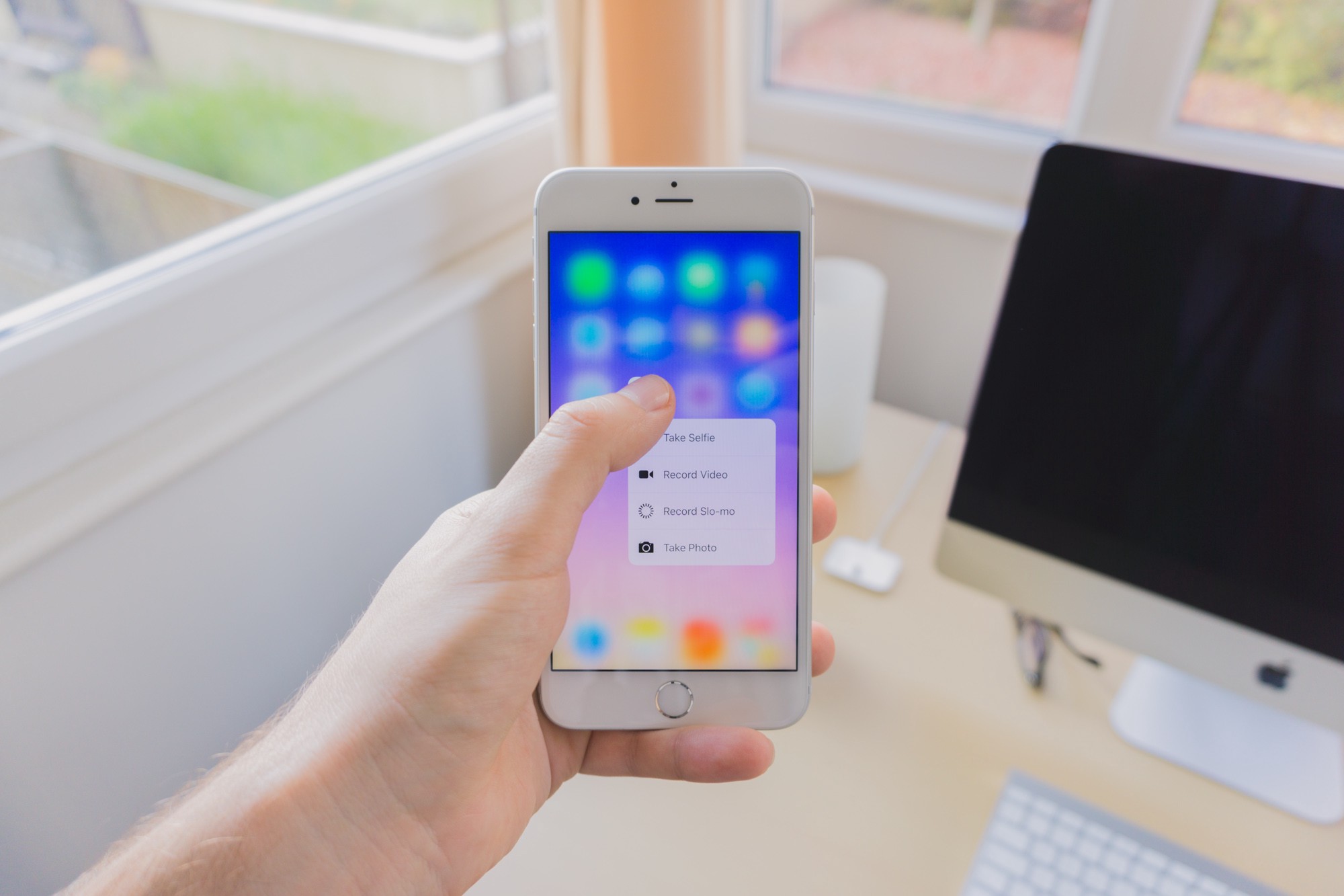
App shortcuts on the home screen are fine, but not life changers — as good apps were already designed in a way so that you can get to their important functions in just a tap or two.
The Dock
The 4S still had the classic 30-pin connector, so I managed to get away with using an iPod dock from 2003, that I also used with my old iPod nano and iPod touch. Crazy! Apple gets a lot of heat for their proprietary connectors, but I have to say, that dock served me for heck of a long time.
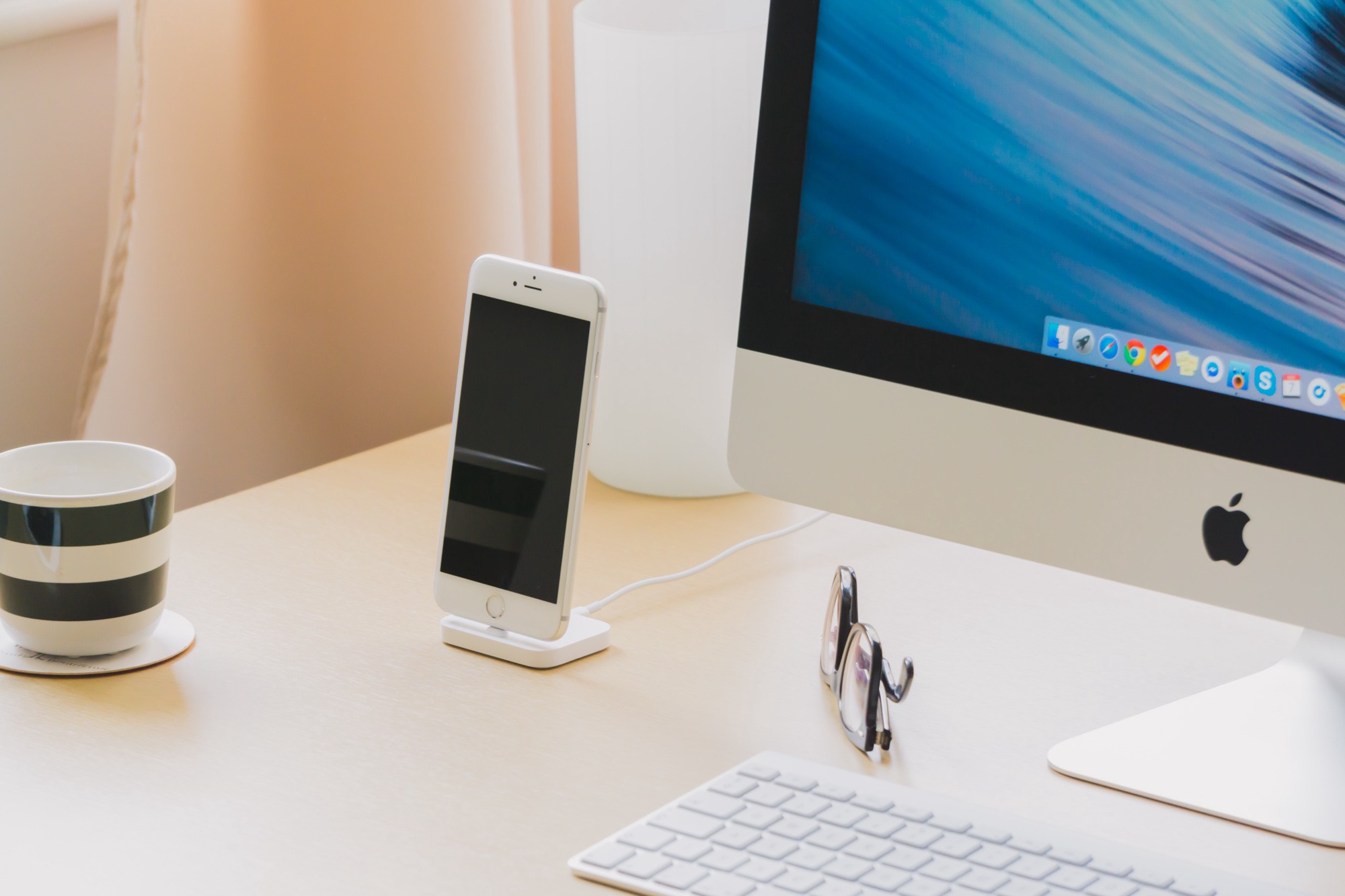
Too bad the new Lightning connector just had to sink this dream boat; with the new connector comes a new dock.
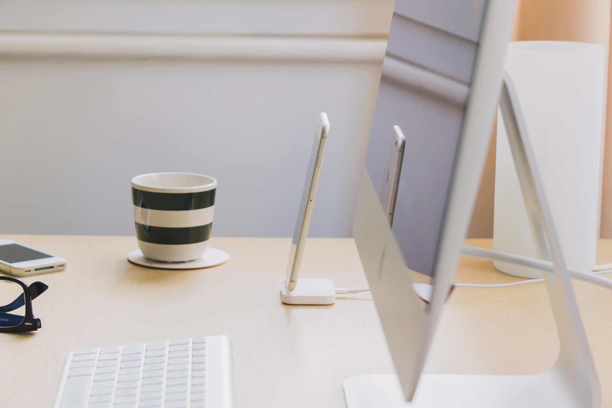
Not a lot has changed in a decade: slim, rectangular, all-rubber bottom, with audio-out on the back. The main difference is that there’s no “ditch” that’s supposed to prop up the device as you place it into the dock, like a cradle. Which is good, because it makes this dock universal: you can even charge the new keyboard and trackpad with it. (But again, why would you?)
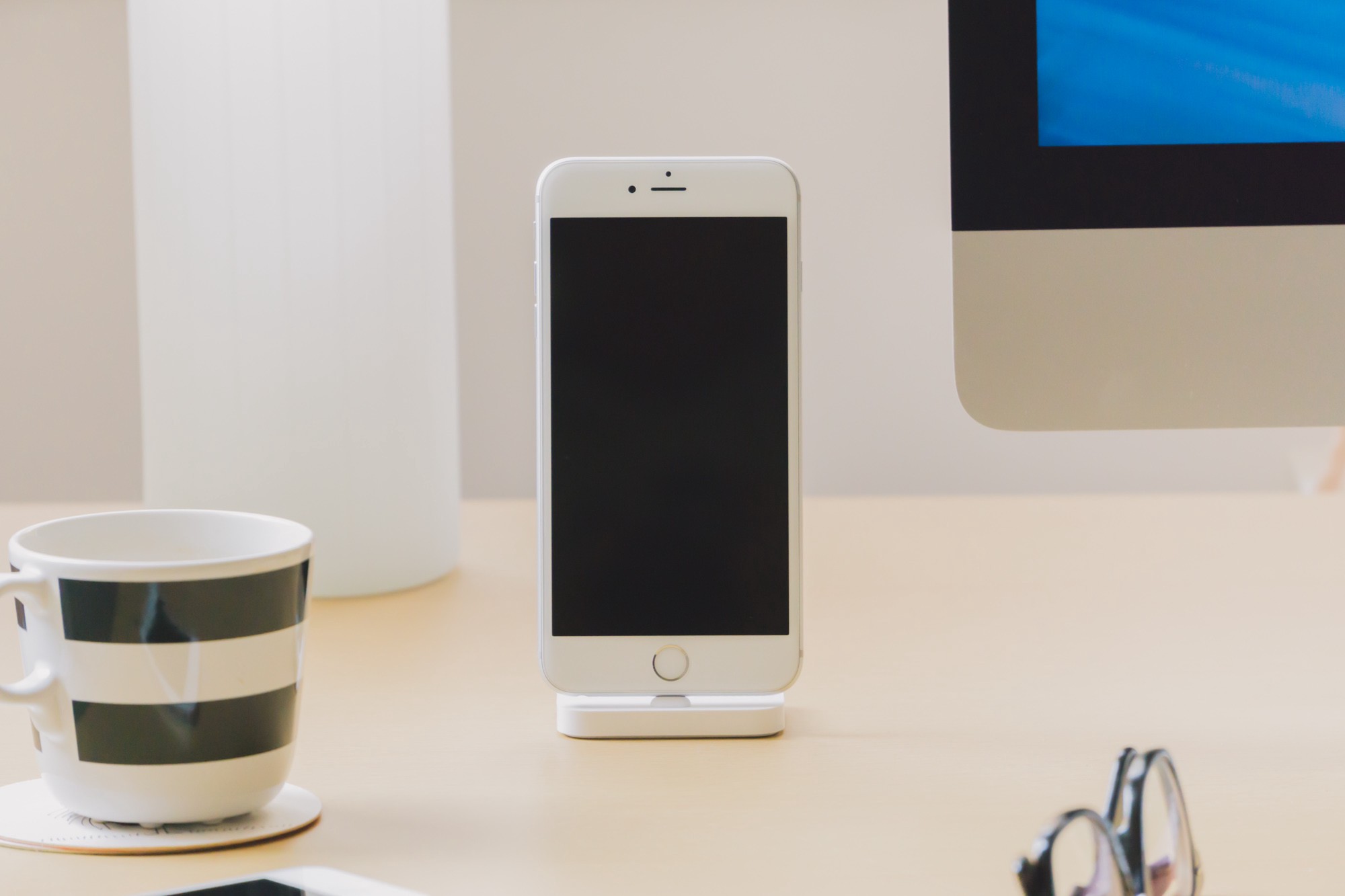
I got the white plastic one instead of the fresh metal ones. Honestly, I just like how it looks.
That’s also one aspect why I bothered getting a dock at all: I just love how the phone sits on my desk like that. It’s also less fiddly than dealing with cables on a regular basis.
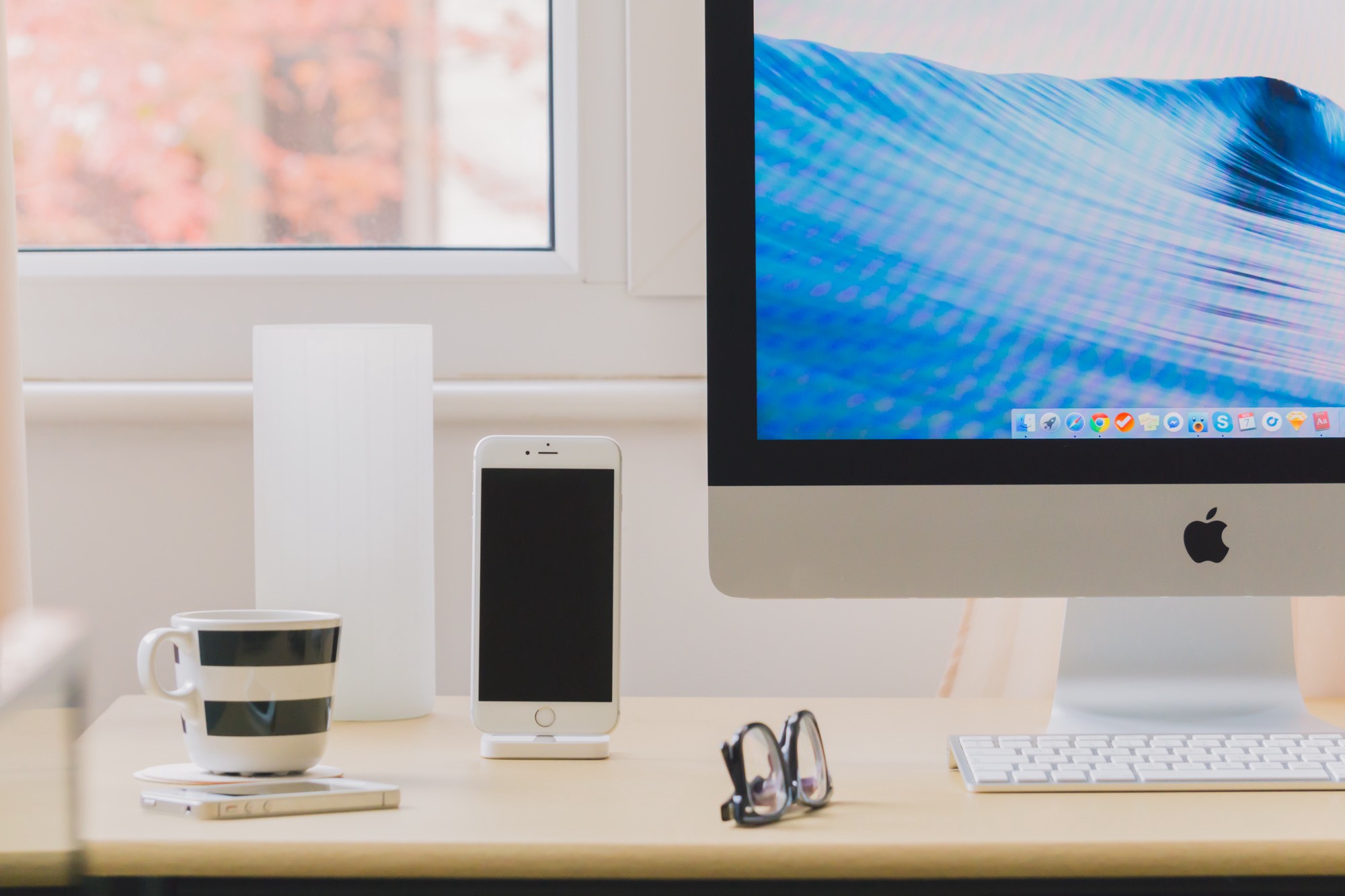
Would have been nice if it came with its own charging cable, but oh well, there’s only so much you get for your $40.
The Silicon Case
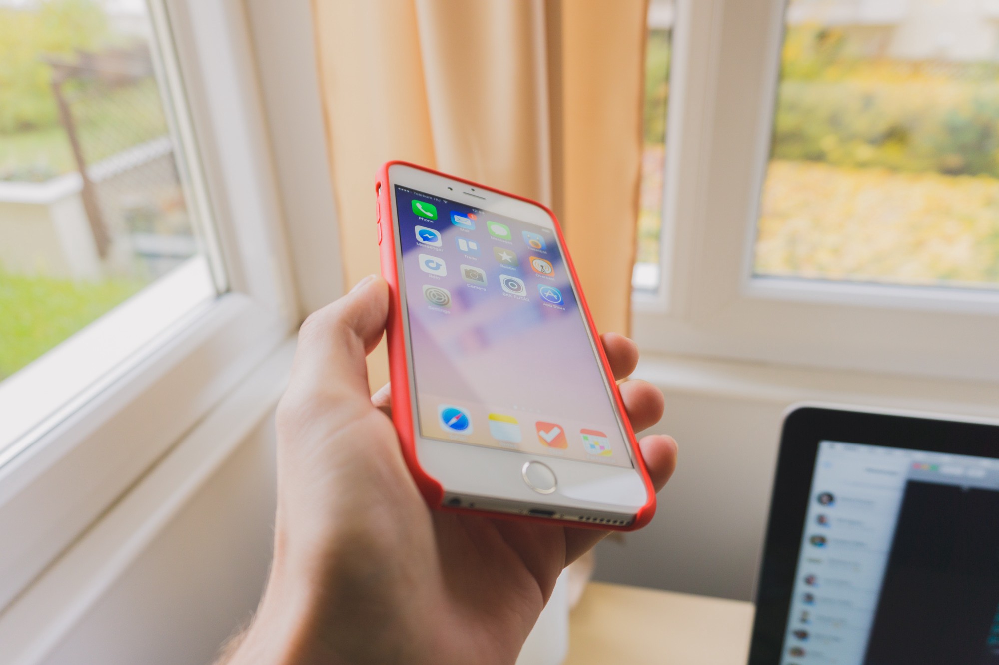
A pretty good but also pretty expensive plastic case. It’s only a few bucks cheaper than the leather one, which makes it a hard sell. But I couldn’t help it: I just loved the colours more. Doubles as a bumper case, solves the bulging camera problem, and it just feels nice to hold.
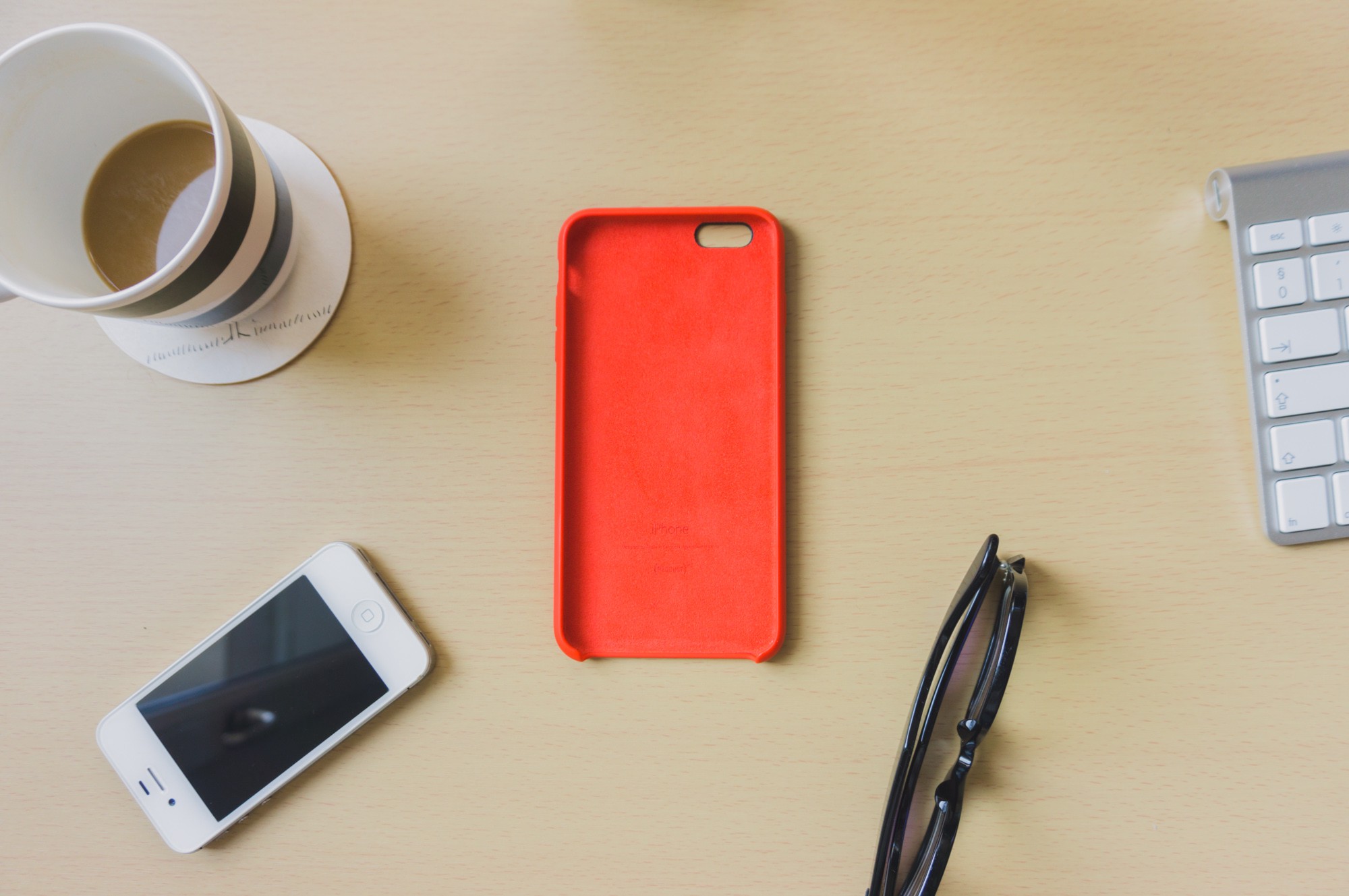
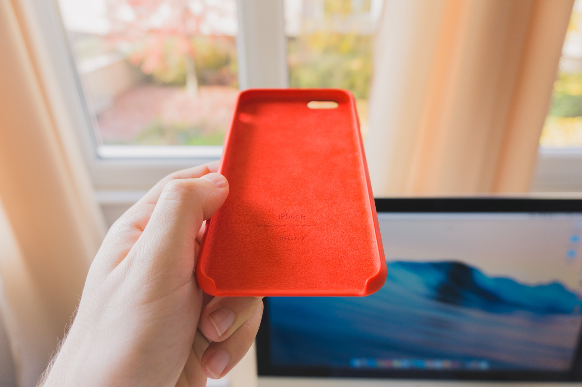
And look, on the inside there’s even this cute carpet for your phone.
So, am I going to buy another huge phone? Right now, I honestly don’t know. I love the spacious screen, but I do miss the practicality of something with a smaller footprint. It’s a mind-boggling compromise.
Hopefully I’ll only have to think about this again in another four years.